Typography-Based Logo Design: Why Less Truly Is More
When people think about logo design, they often picture symbols, icons, illustrations… something visual. But typography-based logo design has quietly become the backbone of modern branding — and honestly, for good reason. As a designer who leans minimal and intentional, I can spot a type-first logo from a mile away, and the ones done well? They always feel elevated, calm, and confident.
And then there are the others — the ones where the kerning is an afterthought, the font choice feels random, and everything reads a little… off. (You know the ones. We’ve all seen them.)
Typography isn’t “the simple option.”
Typography is the discipline.
A truly beautiful typography-based logo looks effortless, but it’s anything but.
Why So Many Logos End Up Looking Cheap
Most logos that feel unprofessional aren’t suffering from one dramatic mistake — they just have too much going on. When someone isn’t sure what they want the logo to communicate, the instinct is to keep adding: more icons, more shapes, more fonts, more “meaning.”
But instead of looking intentional, the design becomes visually loud.
The most common reasons logos end up looking cheap:
• Too many elements competing at once
• Fonts that don’t match the brand’s personality
• Spacing that hasn’t been adjusted or refined
• Designs that fall apart when scaled down
It’s rarely about budget or tools.
It’s about clarity and restraint.
Strong, modern logos — especially typography-based ones — work because every choice has a purpose.
Why Typography-Based Logos Work So Well
1. They age beautifully.
Trends come and go, but clean typography almost always remains timeless. Strip a brand down to its simplest form and what sticks — decade after decade — is the type.
2. They instantly communicate personality.
A delicate serif whispers something completely different than a bold geometric sans. A custom ligature adds charm. Tight kerning communicates modern professionalism.
Typography is emotional, and every micro-decision influences how your brand feels.
3. They scale better across platforms.
From favicons to signage to packaging, typography-led logos adapt effortlessly. No squinting or guessing required.
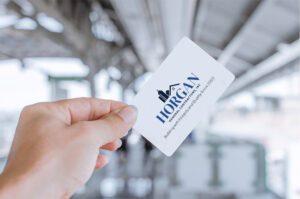
4. They photograph beautifully.
This might be my photographer brain talking — but crisp type in real-life environments always looks elevated. Storefronts, websites, printed materials… clean typography consistently feels premium.
The Art of Designing a Typography-Based Logo (My Approach)
When I design a logo — especially a typography-first one — the work starts long before choosing a font. Minimal designs require the most intention.
1. Clarify the brand mood + direction
Is the brand soft? Bold? Luxe? Editorial? Minimal?
Typography is emotional before it’s visual.
2. Explore type families and potential pairings
I build a collection of promising options and study:
• how the letters interact
• what personality the shapes convey
• whether the structure supports the brand’s tone
• opportunities for subtle customization
3. Modify + refine
This is where a logo becomes yours:
• adjusting kerning
• creating custom ligatures
• modifying glyphs
• balancing proportions
• testing in real-world sizes and mockups
4. Ensure versatility across applications
A professional logo should:
• work in one color
• print cleanly
• be legible at tiny sizes
• feel balanced horizontally and stacked
• adapt across digital + physical spaces
Minimal isn’t simple — it’s intentional.
How to Know If a Typography-First Logo Is Right for You
This style is a strong fit if you value:
• a modern, high-end, minimal aesthetic
• timeless appeal instead of trends
• clean, editorial, or elevated visuals
• versatility across platforms
• a logo that doesn’t rely on an icon to communicate
Brands that want to feel refined, confident, and contemporary almost always benefit from a typography-driven identity.
If You’re Creating a Logo Yourself — A Few Pro Tips
If you’re DIY-ing your branding (many entrepreneurs do!), these simple guidelines go a long way:
• Start with 2–3 versatile fonts, not 20.
• Adjust your letter spacing — don’t trust default settings.
• Avoid decorative or trendy typefaces unless they truly support the brand story.
• Test everything in black + white before adding color.
• Mock it up in real contexts: website, packaging, email signature, business card.
If your logo only works big and full-color, it’s not truly functional.
Typography Is an Art, Not a Shortcut
Typography-based logo design has become a hallmark of modern branding because it offers what so many brands crave: clarity, confidence, and restraint. When the noise is stripped away, what’s left is the essence of your brand — expressed through the most fundamental design element: type.
If your current logo feels busy, disconnected, or just “not quite right,” refining the typography is often where the transformation begins.
If you want to explore a modern, minimalistic approach to logo design, you can explore more here:
• Modern Minimalistic Logo Design
• Branding + Visual Identity Services