A small handful of past design projects, some shared with the thinking behind the work.
Reiki Master Website Design
Branding + New Website for a New Chapter
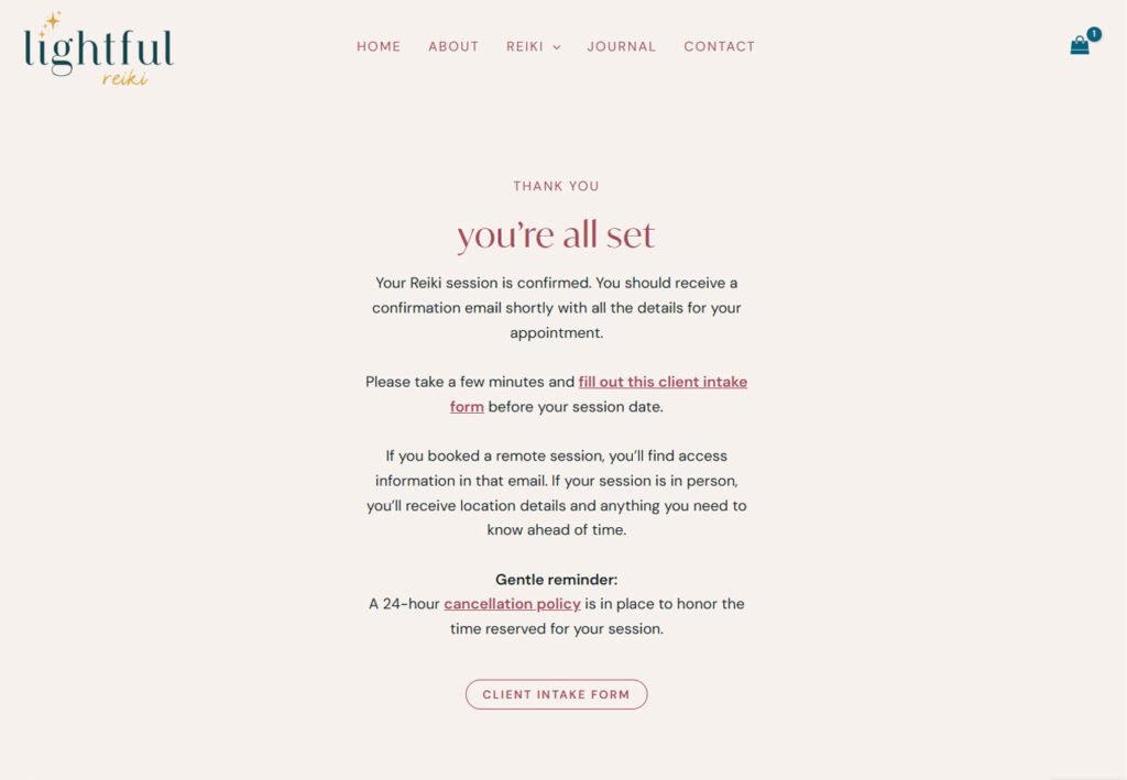
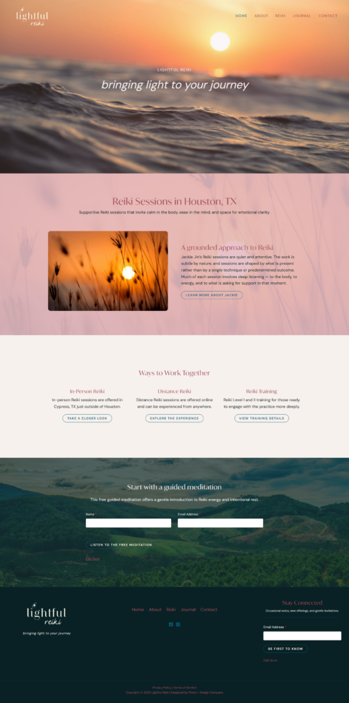
Lightful Reiki came to me with a clear feeling… even before anything was designed. There was already a sense of warmth, color, and intention behind what she was dreaming of building, it just needed to be translated into something visual, cohesive, and scalable.
Visual Direction & Identity
Her Pinterest board said everything without saying anything directly, it screamed cozy sunset glow. That became the anchor.
We built a palette that feels elevated and grounded, but still carries that playful warmth. Something that could hold depth without becoming muted… and stay expressive without feeling too busy. The logo followed that same balance. It’s simple, but intentional, designed to grow with her business.
“Lightful Reiki” works now, but it can just as easily evolve into Lightful Collective, Lightful Studio, or whatever direction she expands into next.
And the small sparkle detail? Just enough whimsy and exactly 7 stars, per her request. A quiet nod to her connection with fireflies, a group of which is called a sparkle! This speaks directly to the deeper meaning behind “lightful” without over-explaining.
Experience & Booking Flow
She was very clear about how she wanted her clients to feel when booking, and honestly, that kind of clarity makes all the difference.
But translating a feeling into an actual user flow? That takes some iteration. We went back and forth refining the experience until it felt natural, intuitive, and aligned with the energy of her work.
The goal wasn’t just “functional.” It was ease, clarity, and a sense of being guided.
Foundations for Growth (SEO + Systems)
Beyond the visuals, we built the structure underneath it all. Email automations to support her client journey behind the scenes.
SEO foundations to start bringing in aligned traffic over time. Because a website build isn’t just about how it looks… it’s about how it works when you’re out there living.
Everything was designed to support where she is now, and where she’s headed next.
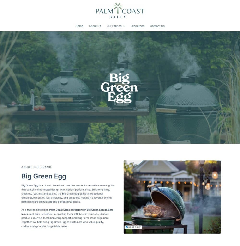
Palm Coast Sales came to me at the tail end of a full brand refresh. Their new visual identity was already in place and what they needed was someone to take that direction and translate it into a website that organized and elevated their online presence.
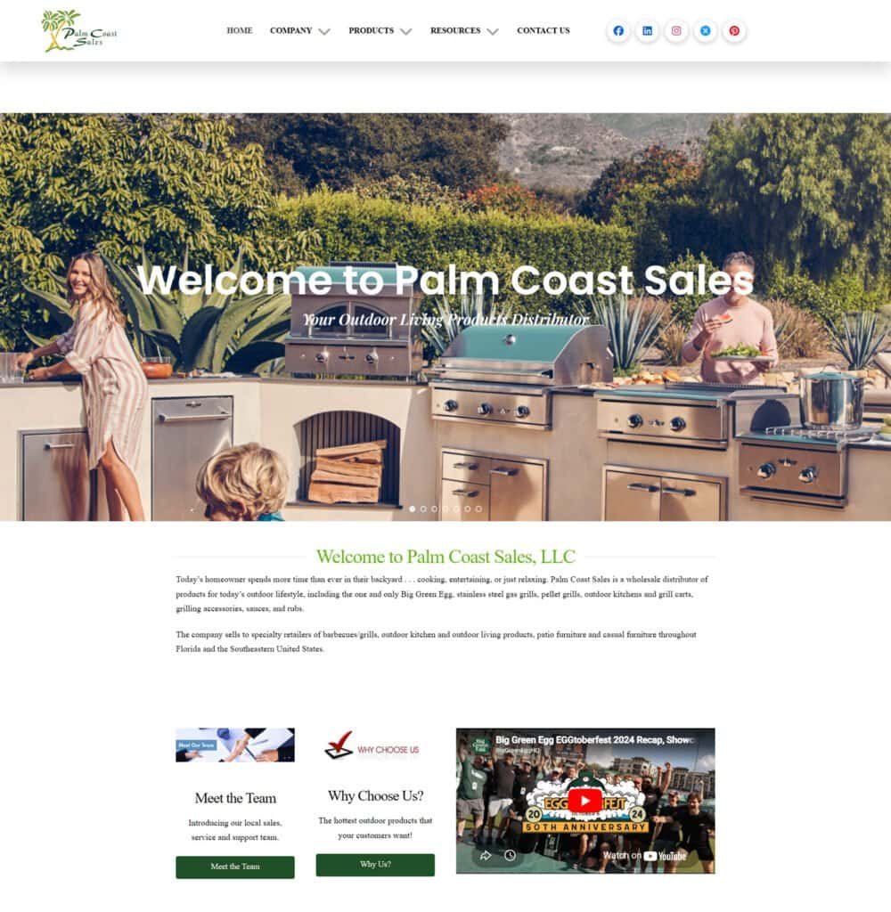
A Before & After Story
Their previous site had been around for a while.
It worked… but it was definitely built for an earlier version of the company.
They’ve grown, expanded across the country, refined their branding, so it was time for the website to catch up.
The shift here wasn’t just visual, though.
It was about creating a cleaner, more modern experience that builds trust immediately.
We didn’t just redesign the site, we strengthened the foundation behind it.
Moving from a.net to a.com domain created a more intuitive and trustworthy entry point, while the new build supports better structure, flexibility, and long-term growth supported by SEO implementation designed to improve visibility over time.
Everything was built to match the level they’re operating at now, and to give their team a system they can confidently maintain moving forward.
More on website design for businesses that have outgrown their old site.
Pretty pictures are nice. Happy clients are better.
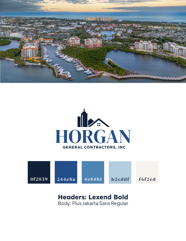
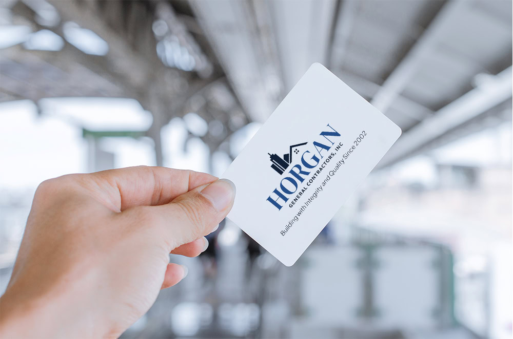
Horgan GCI came to me with an outdated logo and a website that no longer reflected the quality of their work or the scale of projects they manage. Together, we rebuilt their brand from the ground up, elevating their identity, sharpening their messaging, and creating a modern, strategic web presence.
The Starting Point
Horgan’s original logo and website were created over a decade ago. The brand felt dated, inconsistent, and definitely didn’t match the craftsmanship, reputation, or high-end projects they’re known for across Palm Beach County.
What I Delivered
● Refreshed brand identity rooted in credibility, clarity, and modern construction aesthetics
● Fully redesigned logo system with clean geometry and a refined color palette
● A strategic, SEO-driven WordPress website with improved hierarchy, navigation, and user experience
● Updated messaging and copy that speak directly to high-end residential and commercial clients
● Cohesive visual direction across web, branding, and marketing materials
The Result
A polished, professional brand presence that finally mirrors the scale and sophistication of Horgan’s work. Their new website now communicates trust, longevity, and craftsmanship, helping them stand out in a competitive Palm Beach market and making a strong first impression with future clients.
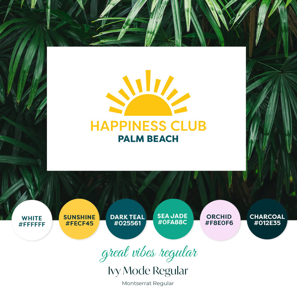
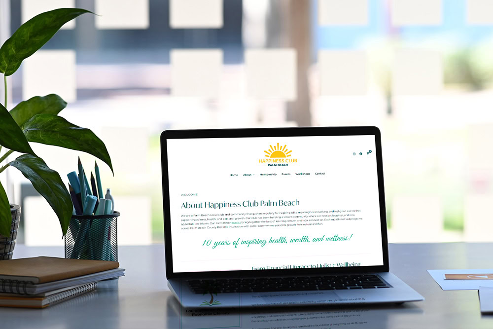
Happiness Club Palm Beach needed a website that could truly support their mission, something modern, organized, and optimized for visibility. I stepped in to rebuild their digital foundation so they could grow their community with confidence.
The Starting Point
Their previous site was dated and not built in a way that could ever be found on Google. It wasn’t a true multi-page structure, wasn’t indexed properly, and had no SEO framework or hierarchy. The logo was usable but needed small refinements, and their color palette lacked the sophistication and warmth that reflects the Palm Beach audience they serve.
What We Brought To Life
● A refined color palette and typography system tailored to their brand and Palm Beach aesthetic
● Polished logo adjustments to elevate proportion and versatility
● A fully rebuilt multi-page WordPress website with proper architecture, SEO structure, and indexing
● Integrated calendar of events system for event bookings and membership sales
● Google Search Console setup so they could finally appear in local search
● Email list integration and backend organization to support future offerings
● A new blog setup and initial posts to help them begin building long-term search visibility
The Result
A clean, well-structured, and search-friendly website that finally gives the Happiness Club a professional online home. They’re now positioned for steady growth with a refined brand identity, a website Google can find, and a platform that supports future events, offerings, and community expansion.
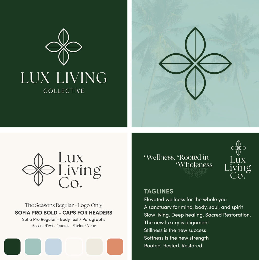
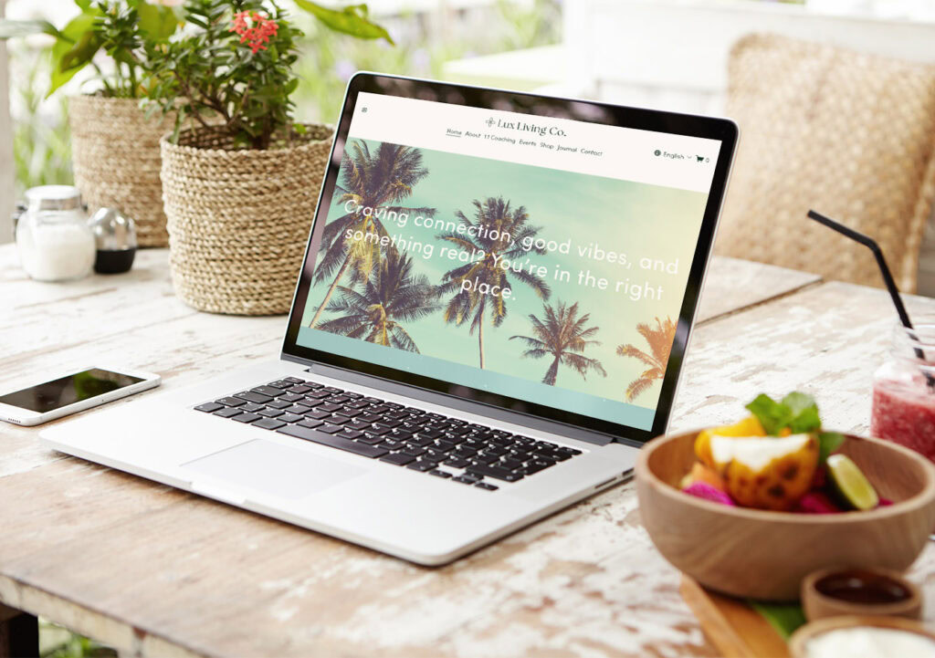
Lux Living Co. is a community-focused brand dedicated to connecting young professionals through wellness, personal growth, and healing in community, always with good vibes at the core. Founded by an NLP hypnotherapist and life coach, their mission is to create spaces that feel supportive, inspiring, and transformational.
The Starting Point
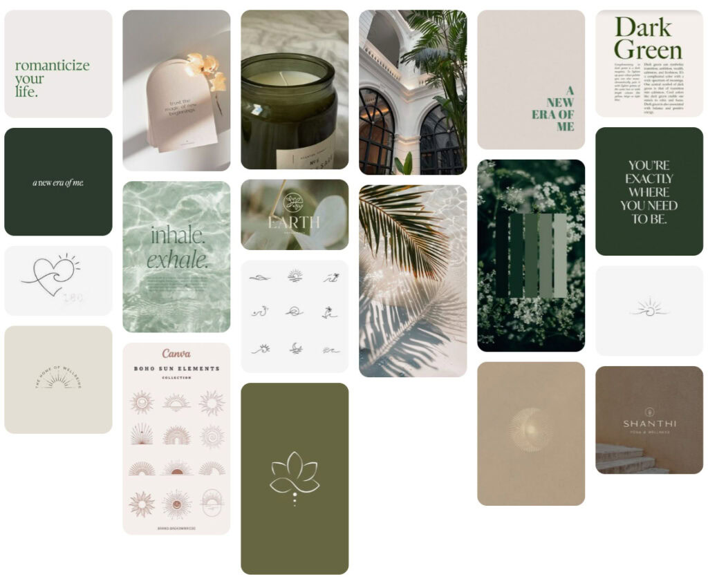
The client shared a Pinterest vision board that captured the mood and energy they wanted to infuse into their brand. What started as a mix of warmth, connection, and modern natural elements ultimately became something with a little more color and fun infused after our initial brand discovery call.
What I Created
● Brand direction
● A growth-focused color palette and typography system that felt fresh, approachable, and aligned with their mission
● Website design with an easy, welcoming flow that reflects the sense of belonging they create in real life
The Result
We translated the heart of the the experience into a visual and digital identity that inspires trust, sparks curiosity, and makes every visitor feel invited.
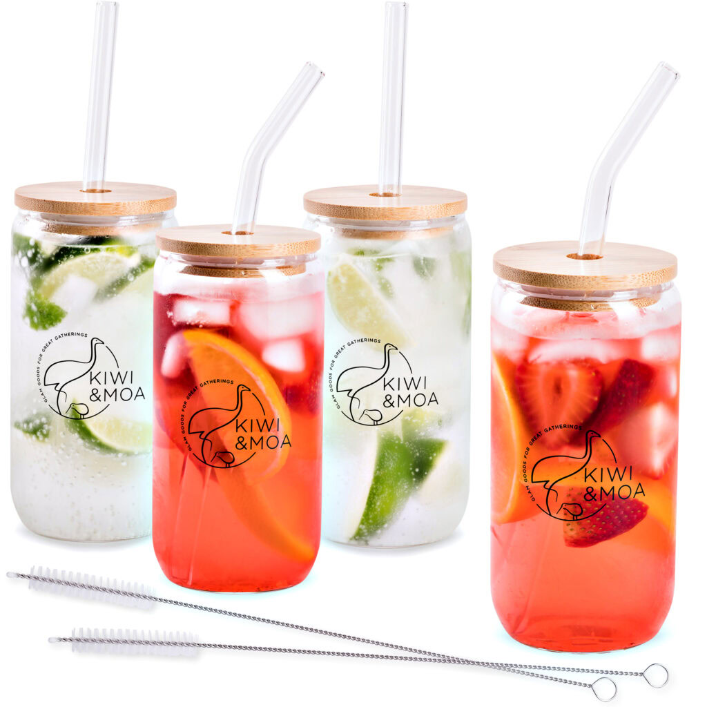
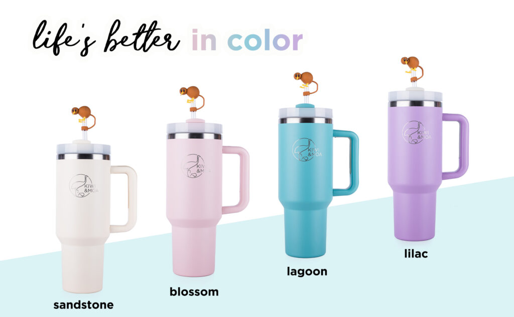
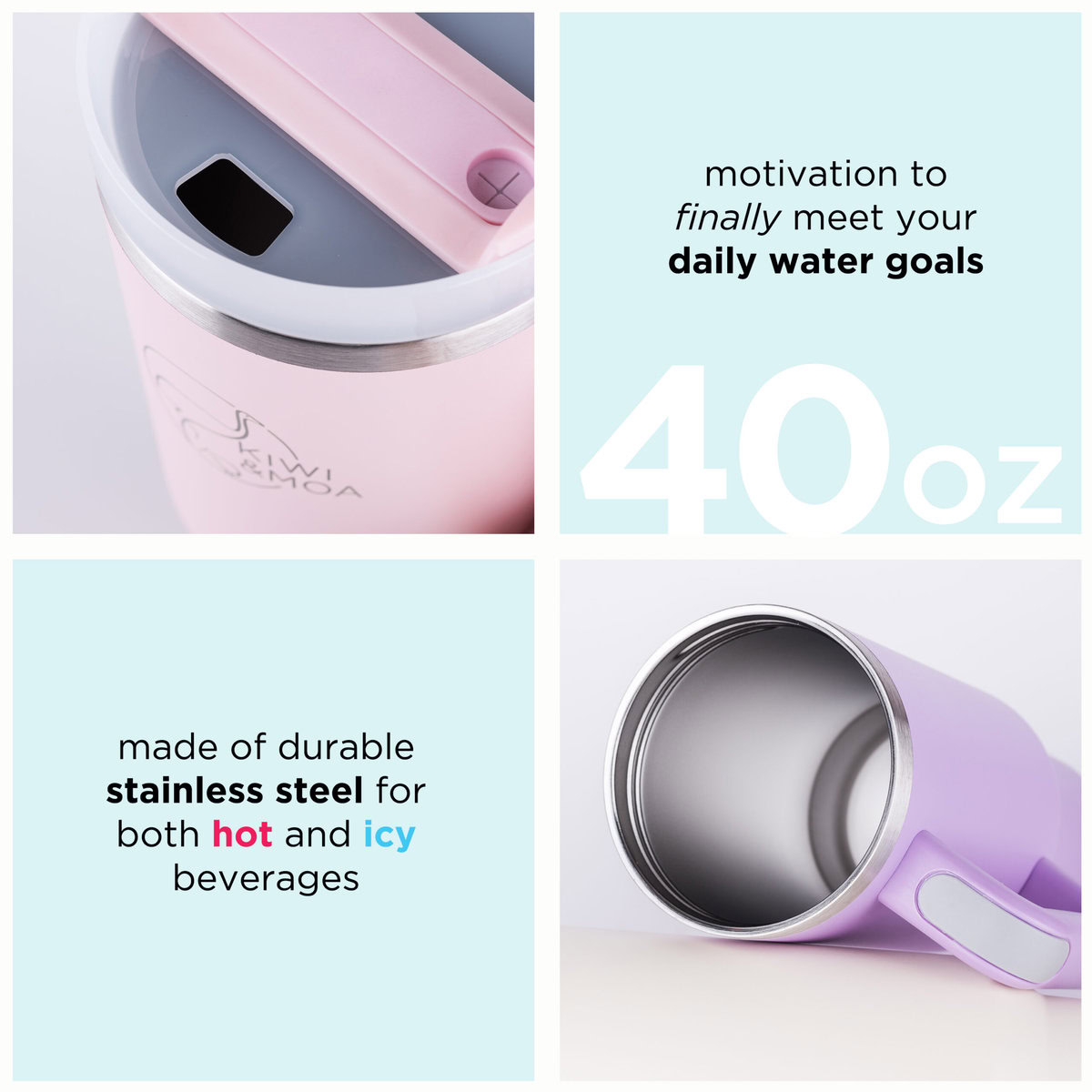
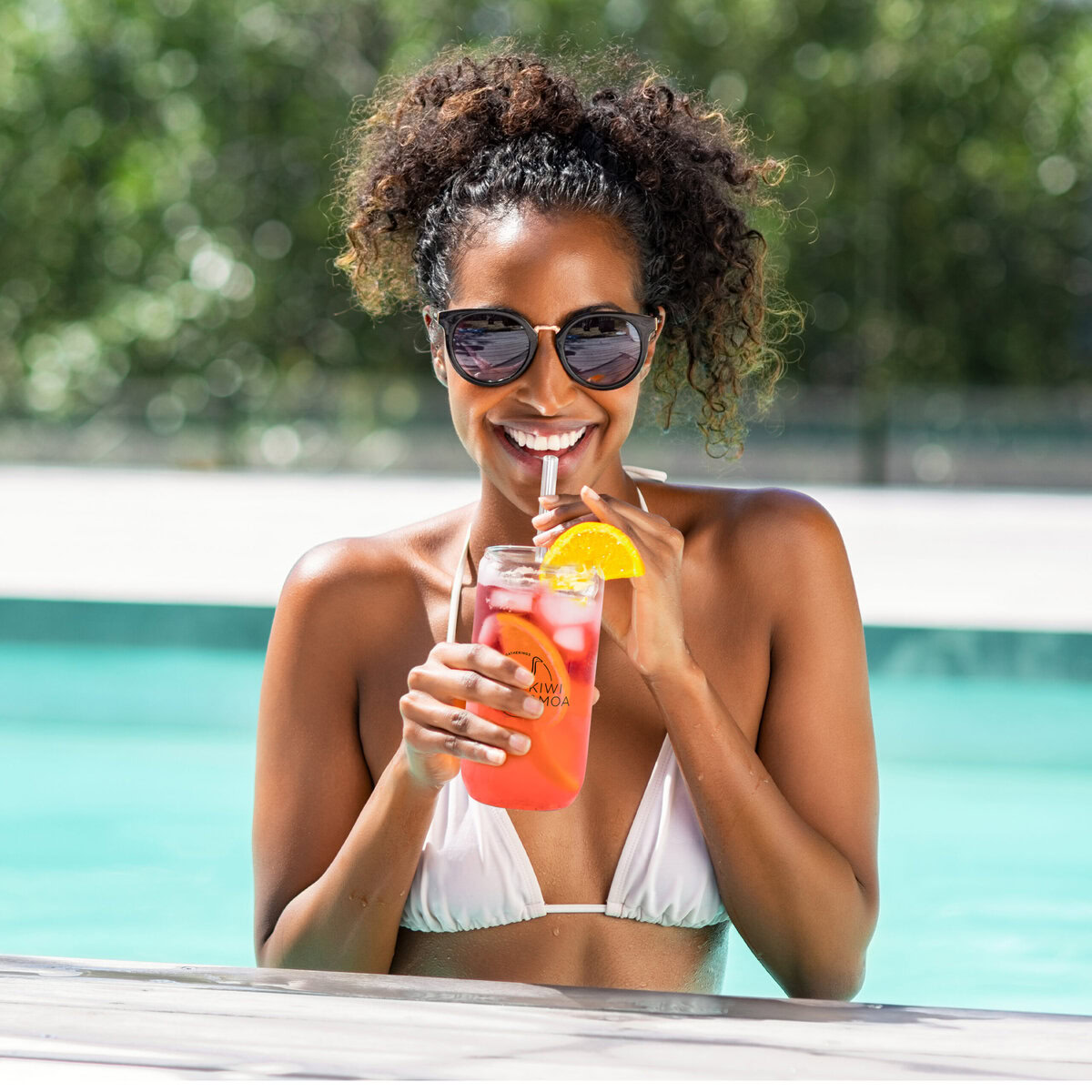
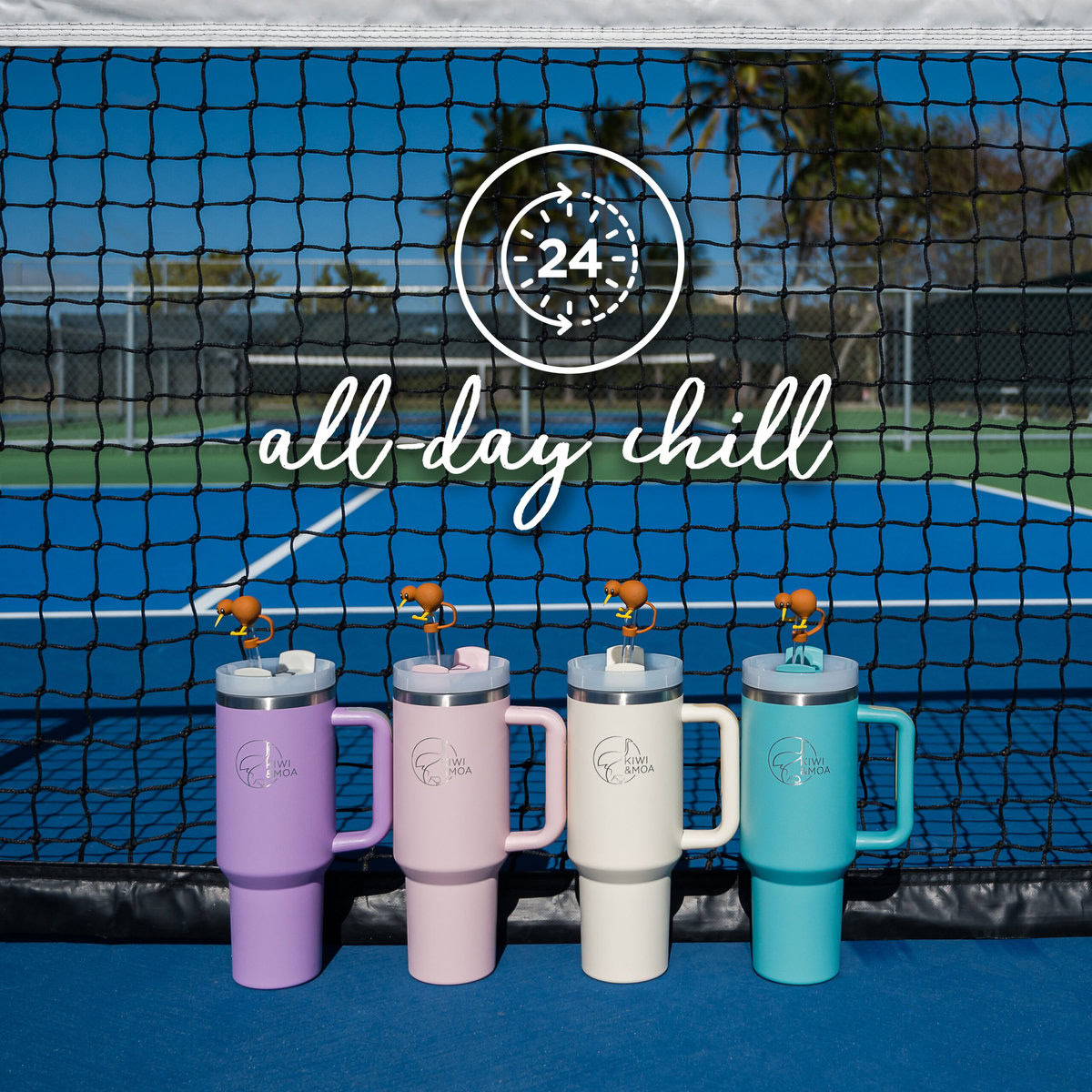
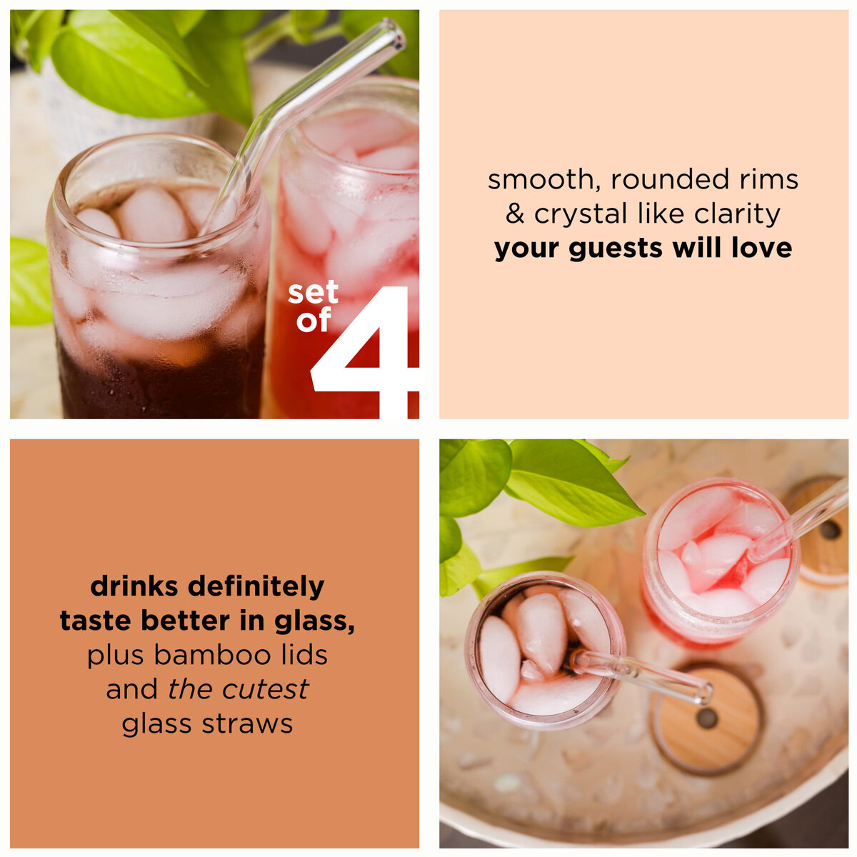
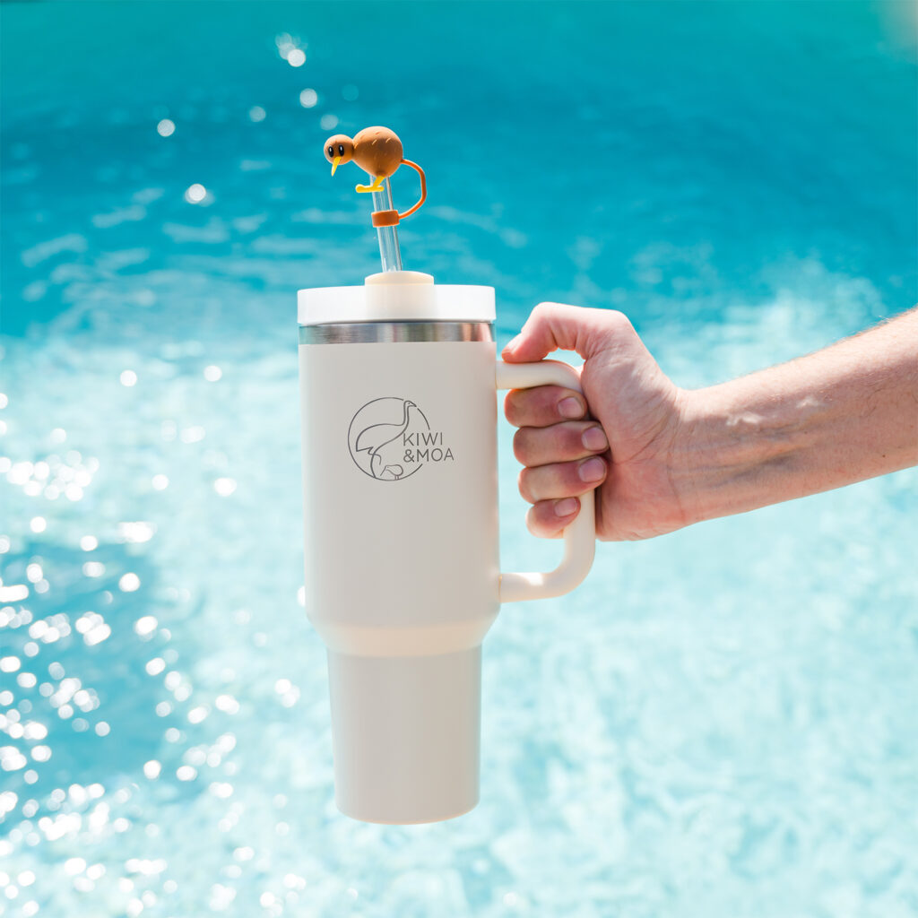
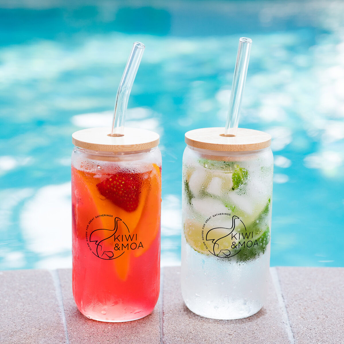
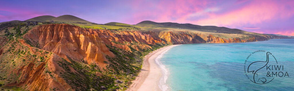
Kiwi & Moa is an Aussie-inspired drinkware brand featuring tumblers, bamboo lids, and glassware.
The Starting Point
The client had a logo but no clear brand personality or other visual assets for their products.
What I Created
● Brand voice guidelines to shape all product descriptions and marketing copy
● Creative naming for tumblers (“The Kiwi Chill”) and colorways to add personality
● Development of a cohesive brand vibe aligned with their logo
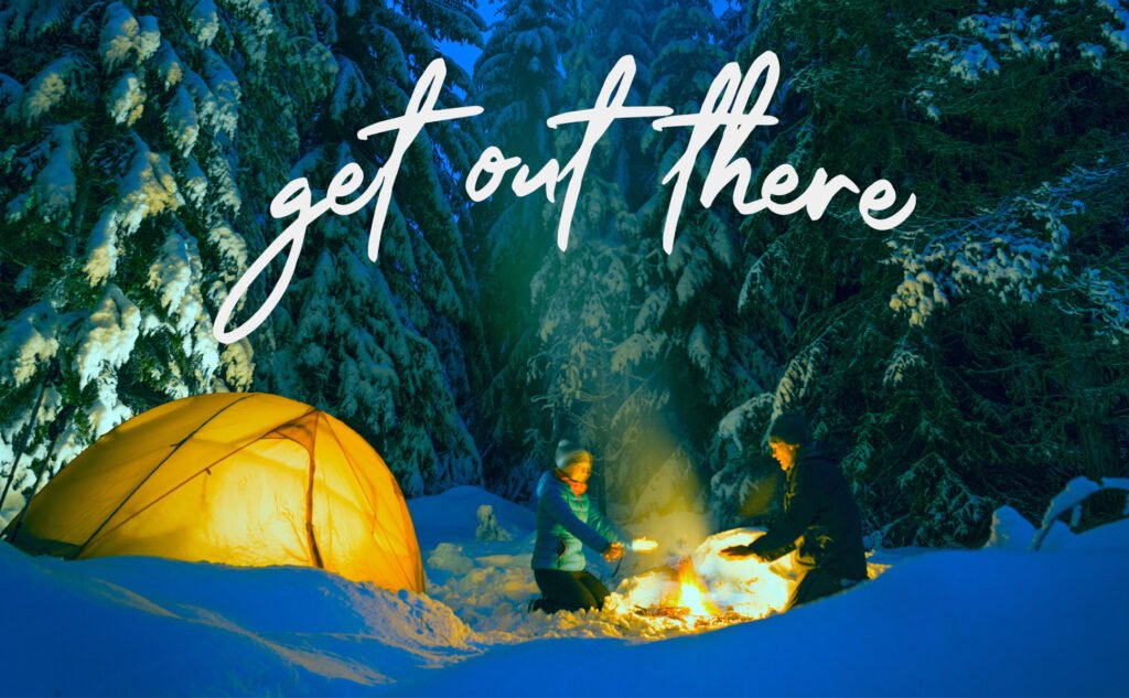
● Lifestyle imagery concepts for marketing and listings
The Result
A playful yet polished brand identity that gave the products personality, strengthened their market positioning, and made the line instantly more memorable for customers.
Brand Voice + Amazon Listing Photography + Design Work
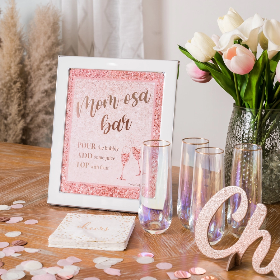
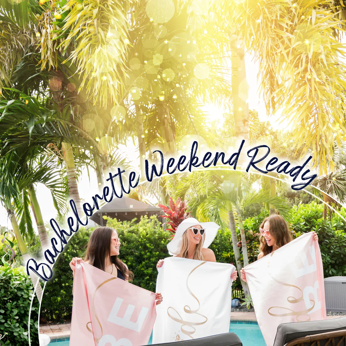
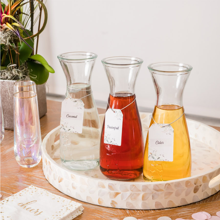
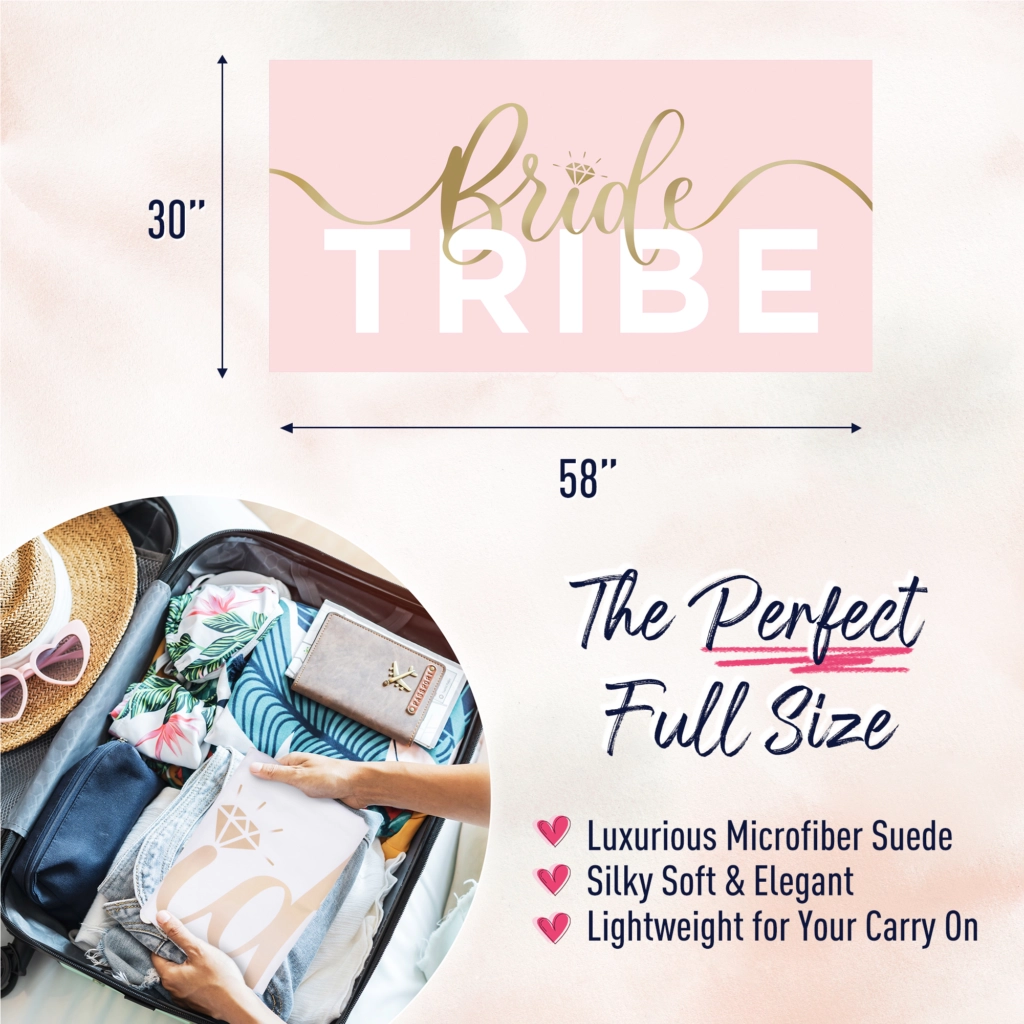
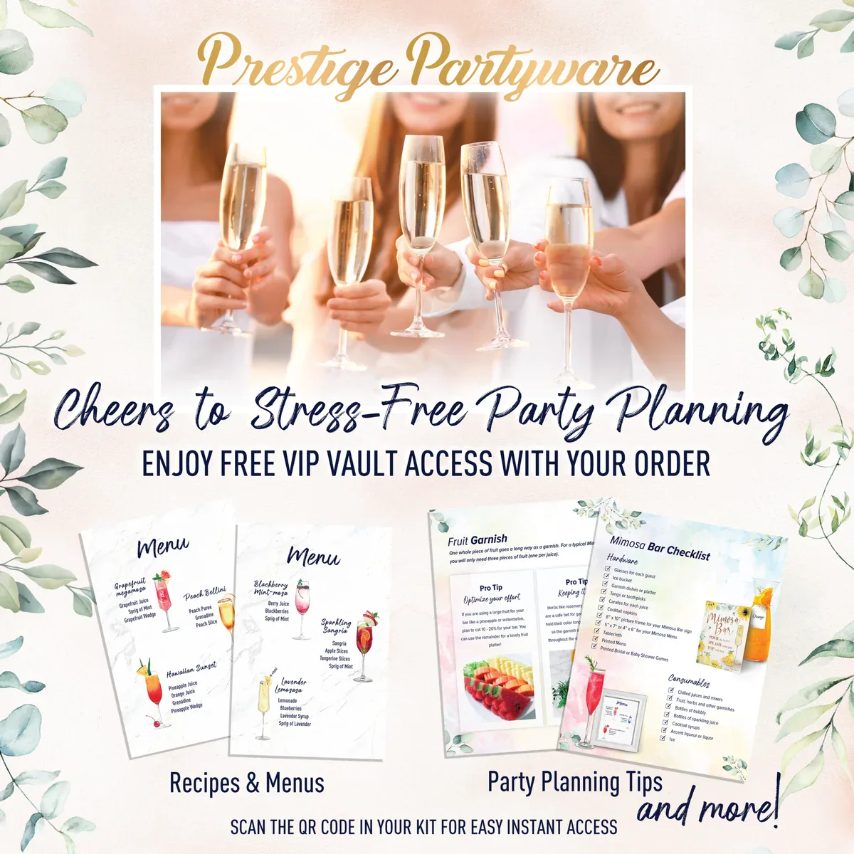
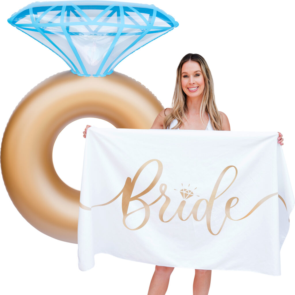
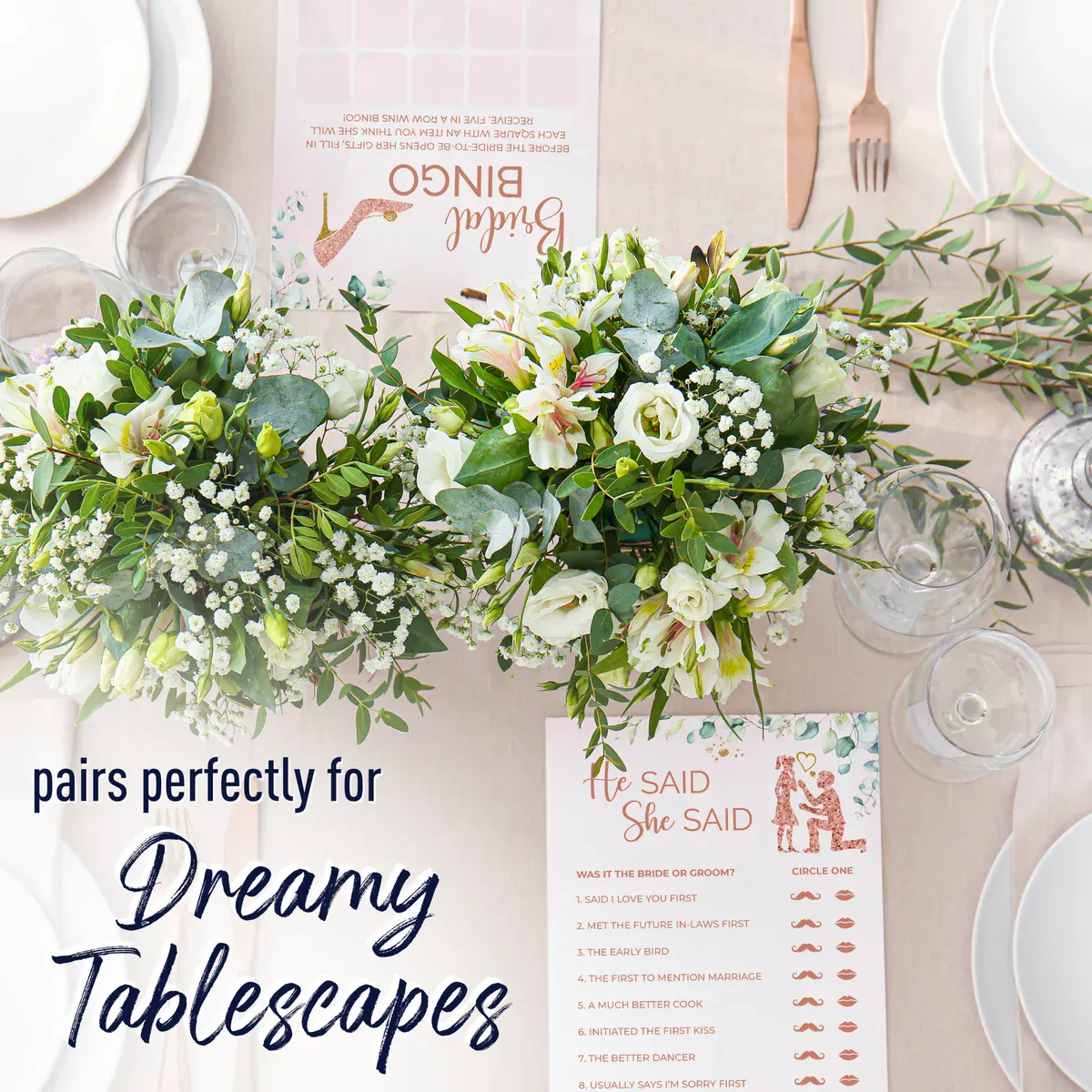
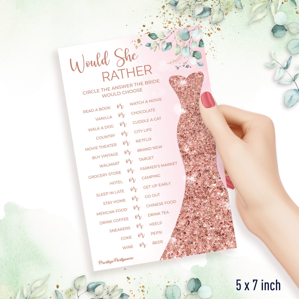
Prestige Partyware is a bridal and celebration brand offering products like mimosa kits, banners, ring floats, and more.
The Starting Point
The client had a logo and some existing images but needed to elevate the vibe of their Amazon listings and develop a brand voice that spoke directly to their target audience.
What I Created
● Brand voice guidelines based on ideal audience preferences
● Amazon listing imagery that reflected a Pinterest-worthy, celebratory vibe
● Co-creative design process with the client to ensure alignment
● Lifestyle, model and product photography for key listings
The Result
Stronger, more cohesive product listings and brand story that better reflected the brand’s fun, elevated style to help increase conversion rates and customer engagement.
I care about your privacy. This notice is just to let you know that I use a few simple cookies to see which pages people visit and keep the site running smoothly.
Functional
Always active
These cookies are essential for the site to work properly. They handle things like page loading, navigation, and basic functionality, so everything runs the way it should.
Preferences
The technical storage or access is necessary for the legitimate purpose of storing preferences that are not requested by the subscriber or user.
Statistics
The technical storage or access that is used exclusively for statistical purposes.These cookies help me understand how people use the site, like which pages get visited and what’s actually helpful. The information is collected in a general, anonymous way and isn’t used to identify you personally.
Marketing
The technical storage or access is required to create user profiles to send advertising, or to track the user on a website or across several websites for similar marketing purposes.