Website Color Scheme Ideas That Actually Work in Real Life
Looking for website color scheme ideas usually starts with inspiration and ends in confusion. At least that was my experience.
Everything looked good when it was a single image or a mockup. But once I tried to apply those colors across an actual website, things shifted. Text felt harder to read. Buttons disappeared. Pages stopped feeling cohesive. The idea was strong, but the execution felt eh…
Anyway, the goal here isn’t to suggest you copy a trendy palette.
It’s to help you choose a website color scheme that can hold up over time and across your entire site.


Start with a neutral foundation
The most reliable website color schemes always start quieter than people expect.
Neutrals give your site room to breathe. They create space for content, images, and accents to do their job. White, off-white, warm gray, soft beige, charcoal. These are not boring choices. They are stabilizers.
A strong neutral background makes every other color decision easier. It also helps your website color palette scale as you add pages, offers, and content in the future.
Add one strong anchor color
Every good website color scheme has a clear anchor.
This is the color that shows up consistently in key places. Headings, links, buttons, accents. It gives your site identity without overwhelming it.
The mistake people make is choosing too many anchor colors. When everything is important, nothing is. One strong color used intentionally will carry more weight than five competing ones.
Use accent colors sparingly and with purpose
Accent colors should support action, not decorate every corner.
They work best when they highlight moments that matter. Calls to action. Icons. Small details that guide the eye. If an accent color shows up everywhere, it stops feeling special and starts feeling noisy.
A good rule of thumb is this. If removing an accent color wouldn’t change how someone uses your site, it might not need to be there.

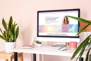
Seeing website color schemes applied in context makes it so much easier to move from ideas to decisions.
Think in combinations, not swatches
This is where most website color scheme ideas fall short.
Colors do not live alone on a website. They live behind text, next to images, inside buttons, and across sections. A palette that looks balanced as swatches can behave very differently once you start layering real content on top of it.
This is where using a color palette builder changes everything. Instead of guessing, you can see how your colors behave together in real situations. Backgrounds with text. Buttons with labels. Accents next to neutrals. It turns inspiration into something you can actually test and refine.
Make contrast part of the idea, not an afterthought
Some website color schemes fail quietly. They look fine at first glance but feel harder to read the longer you’re on the page.
Contrast is what keeps a site comfortable to use. It supports readability, accessibility, and trust. High contrast does not mean harsh or ugly. It means intentional separation between elements so the eye knows where to go.
If you want a quick sanity check, using a free color contrast checker can show you whether a pairing works before you commit to it. This is especially helpful if you love softer palettes and want to make sure they still hold up in practice.

Build schemes that can grow with your site
The best website color schemes are flexible.
They work on a homepage and a sales page. They hold up with long-form content. They support future offers without needing a full redesign. This is why systems matter more than single ideas.
Testing your website color palette in context helps you build something that grows with your business instead of boxing you in.
Inspiration is a starting point, not the finish line
Website color scheme ideas are everywhere. The ones that actually work are the ones that move past inspiration and into application.
When you focus on function, contrast, and real use cases, your color choices become clearer. The process feels calmer. And the result feels intentional instead of forced.
If you want help turning ideas into a palette that works across your entire site, testing your colors before committing is always the next step.