WCAG Color Contrast, Sans Headache
A designer-friendly explanation of WCAG color contrast for websites and brands.
What does WCAG mean?
WCAG stands for Web Content Accessibility Guidelines — the global standard for making digital content accessible to people with disabilities. It’s developed and maintained by the World Wide Web Consortium (W3C), the international body that sets technical standards for the web.
The W3C’s WCAG color contrast guidelines exist specifically to ensure that text and interface elements remain readable across different screens, lighting conditions, and visual abilities. As the W3C states in the official guidelines, the goal of these requirements is to ensure text can be read by people “who have low vision or a color deficiency” — and that adequate contrast makes content usable without requiring users to have perfect vision.
Think of WCAG color contrast guidelines less as a rigid rulebook and more as a practical, internationally recognized framework for designing websites and content that work for real people in real conditions.
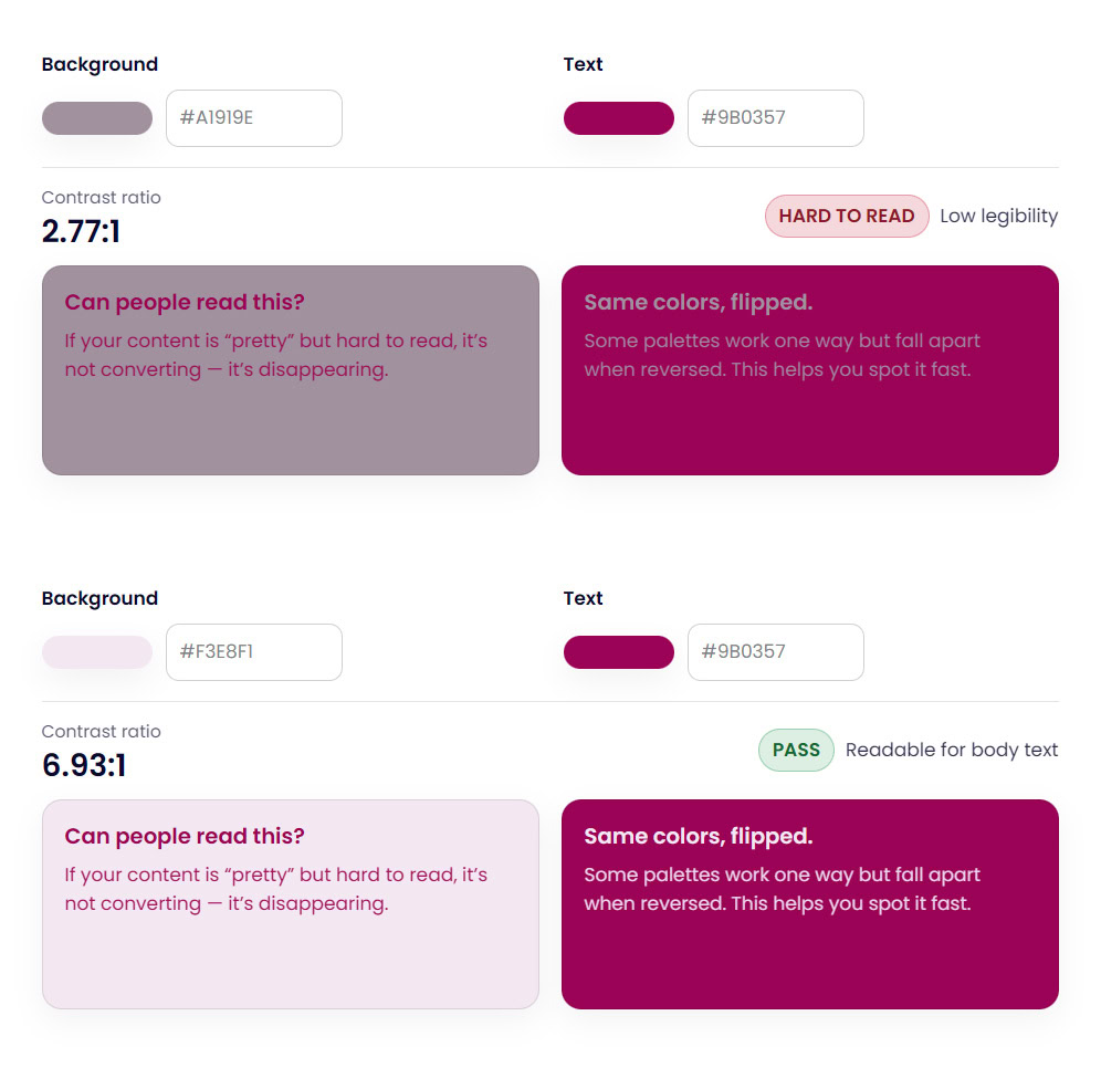
Example of WCAG color contrast showing readable vs hard-to-read text combinations.
Be sure to check out my Free Color Contrast Checker if you need a simple one, or the fuller Color Palette Lab for more features.
What Is WCAG Color Contrast?
The W3C’s WCAG color contrast guidelines specify minimum contrast ratios for text and background color combinations. These are the core benchmarks designers and developers work with:
The most widely required compliance level is WCAG 2 AA, which is the standard referenced in most accessibility policies, legal requirements, and website audits. Under WCAG 2 AA:
- Normal body text requires a minimum contrast ratio of 4.5:1
- Large text (18pt or 14pt bold and above) requires at least 3:1
- UI components and graphics (buttons, icons, form borders) require at least 3:1 against adjacent colors
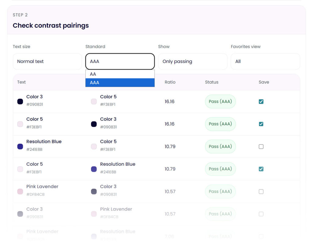
The enhanced WCAG AAA level raises those requirements to 7:1 for normal text and 4.5:1 for large text — rarely required but worth knowing if you’re designing for maximum accessibility.
Contrast ratios range from 1:1 (no contrast at all — like white text on white) to 21:1 (maximum contrast — black on white). The 4.5:1 threshold for body text is the practical sweet spot the W3C’s WCAG color contrast guidelines land on: high enough to support low vision users, achievable enough for real brand design.
You can read the full WCAG color contrast guidelines directly in the W3C’s official documentation at w3.org/TR/WCAG22.
Are WCAG color contrast guidelines legally required?
In many cases, yes — or they’re becoming so. In the United States, the ADA (Americans with Disabilities Act) has been interpreted to require website accessibility, and WCAG AA is the standard most courts and regulators point to. In the European Union, the European Accessibility Act has required WCAG compliance for many digital products since June 2025. Even outside of legal requirements, following WCAG color contrast guidelines protects your business, improves usability, and signals professionalism — particularly important for brand websites where trust affects conversion.
Why WCAG Color Contrast Matters for Websites and Brands
Low contrast doesn’t always look wrong at first glance. That’s what makes it tricky.
A color pairing can feel subtle, stylish, or soft and still create usability problems in real use. Over time, low contrast increases eye strain, reduces clarity, and quietly erodes trust. Visitors may not know why a site feels harder to read, but they feel it.
Strong WCAG color contrast supports:
- Readability
- Accessibility
- Usability
- Professional credibility
This is especially important for brand websites, where trust and clarity directly affect conversion.
WCAG Contrast Ratios (The Simple Version)
WCAG uses contrast ratios to measure the difference between text and background colors. Higher ratios mean stronger contrast.
You don’t need to memorize exact numbers to design responsibly, but it helps to understand the basics:
- Body text needs stronger contrast
- Large text can use slightly lower contrast
- Decorative text should never replace readable text
Instead of guessing or calculating ratios manually, consistently checking your combinations is what actually matters.
Common WCAG Color Contrast Mistakes
Most WCAG color contrast issues don’t come from bad design. They come from assumptions.
Common mistakes include:
- Light gray text on white backgrounds
- Brand colors used for body text without testing
- Buttons that look fine visually but disappear for some users
- Accent colors that don’t stand out enough against backgrounds
These problems often show up only after a site is live, when fixing them feels harder than it should be.
WCAG Color Contrast for Designers
If you design websites, interfaces, or brand systems for clients, WCAG color contrast becomes more than a one-time check. It becomes part of how you structure a design system.
Instead of thinking about contrast as a single text-on-background test, designers often need to evaluate contrast across multiple components and states, such as:
• Body text on light and dark backgrounds
• Button text on primary and secondary button colors
• Links and hover states
• Card components and callout sections
• Icons and UI elements against different backgrounds
A color combination that works perfectly in one place may fail somewhere else in a layout. For example, a color that passes contrast for body text might fail when used for smaller UI labels or form inputs.
This is why many designers evaluate contrast at the palette level, not just as individual pairs. When brand colors are tested together early in the design process, accessibility issues are easier to solve before layouts are finalized.
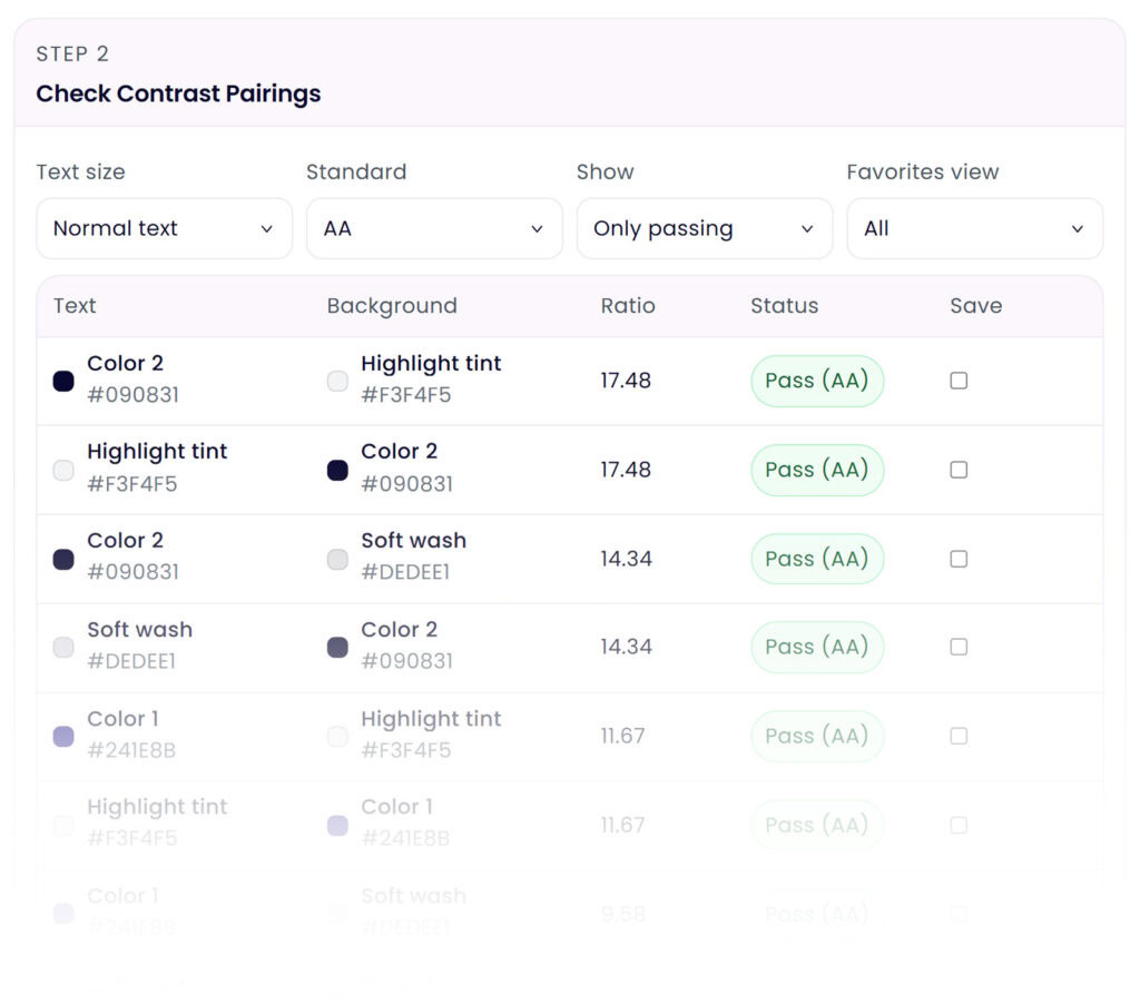
Tools that allow designers to evaluate multiple color pairings at once can make this process much faster, especially when building brand systems or website style guides.
How to Check WCAG Color Contrast Without Overthinking It
This is where tools save time and mental energy.
Using a free color contrast checker lets you instantly test WCAG color contrast against each pair without memorizing ratios or guidelines. You can see whether a color pairing passes accessibility standards in seconds, instead of second-guessing your eye.
A color contrast checker is especially helpful when working with brand colors, because it allows you to keep the overall feel intact while making small, intentional adjustments where needed.
When building a full brand palette, checking every combination one pair at a time can become tedious quickly — which is why color palette tools like The Color Palette Lab™ that evaluate multiple color pairings at once can dramatically speed up the process.
Why WCAG Color Contrast Should Be Part of Your Color Palette Process
The easiest way to avoid contrast issues is to think about them early.
When WCAG color contrast is considered while building a brand or website color palette, accessibility becomes part of the system instead of a patch later. This is why using a color palette builder that allows contrast testing in context is so effective.
You’re not just choosing colors. You’re building a palette that works together across real layouts.
Where the Color Palette Lab Fits In
This is where most designers and founders get stuck.
You want your brand and website colors to feel cohesive and meet WCAG color contrast guidelines. But testing contrast one pair at a time doesn’t always show you the full picture. Colors behave differently across backgrounds, text, buttons, and accents.
The Color Palette Lab is designed for this exact moment.
Instead of checking contrast in isolation, you can test and refine brand and website color palettes as a system. You see how colors work together, where contrast needs adjusting, and how small changes improve accessibility without changing the overall feel of your brand.
It turns WCAG color contrast from a checklist into part of your actual design process.
👉 Explore the Color Palette Lab
(Build and test brand and website color palettes that actually work in real use.)
Accessible Website Colors Don’t Mean Boring Design
This matters enough to say clearly.
Accessible color contrast does not mean harsh black and white designs. It does not mean killing softness, personality, or brand expression. It means making intentional choices so your content is usable by more people.
Some of the most beautiful websites work precisely because their color contrast is well designed.
WCAG Color Contrast Is Easier When It’s Built In
WCAG color contrast doesn’t have to be something you fix later or stress about at the end. When contrast is considered while building your brand or website color palette, accessibility becomes part of the foundation.
You can start small by checking individual color pairs. But if you want to build brand and website palettes that stay readable, cohesive, and flexible as your site grows, testing everything together matters.
That’s exactly what the Color Palette Lab is for.
FAQ: WCAG Color Contrast
What contrast ratio is required for WCAG compliance?
For WCAG AA, the most widely used standard:
- Normal body text must have a contrast ratio of at least 4.5:1
- Large text (18px+ or 14px+ bold) must have 3:1
- User interface elements like buttons and icons also need 3:1
WCAG AAA raises those requirements to 7:1 for body text and 4.5:1 for large text, though AAA compliance is rarely required for typical business websites.
What is the easiest way to check WCAG color contrast?
The easiest way is to use a color contrast checker that calculates the ratio between two colors automatically.
These tools let you paste in hex color values and instantly see whether the pairing passes WCAG accessibility standards. Many designers use them when testing brand colors, website typography, and interface elements.
Do brand colors have to meet WCAG contrast rules?
Brand colors themselves don’t need to pass WCAG guidelines on their own. What matters is how the colors are used together.
For example, a soft pastel brand color may not work well for text, but it can still be used for backgrounds, decorative elements, or accents when paired with a darker readable text color.
If you want a step-by-step walkthrough of applying contrast rules to a brand palette, see How to Build an Accessible Brand Color Palette (Without Killing Your Vibe).
What colors usually fail WCAG contrast guidelines?
The colors most likely to fail WCAG contrast requirements are very light colors, especially when paired with white text.
Common examples include:
- Yellow
- Light pink
- Pale lavender
- Soft sage
- Bright coral with white text
These colors can still work beautifully in a brand palette when paired with darker text colors instead.
Is WCAG color contrast required by law?
In many regions, accessibility regulations reference WCAG standards.
In the United States, the ADA has increasingly been interpreted to require accessible websites, with WCAG AA used as the benchmark in many cases. The European Accessibility Act also references WCAG for digital accessibility requirements.
Even when not legally required, following WCAG guidelines improves readability and usability for everyone.


