How to Build a Brand Color Palette That Works Everywhere
Building a brand color palette can feel deceptively simple.
You pick a few colors you like, put them next to each other, and hope they behave. Sometimes they do. Often, they don’t. What looked good in isolation starts to fall apart once you use it on a website, social graphics, packaging, or real content.
A strong brand color palette isn’t about taste alone. It’s about building a system that holds up everywhere your brand shows up.
Start with how your brand needs to function
Before choosing colors, it helps to get honest about where they’ll be used.
Brand colors don’t live on a mood board. They live behind text, next to images, inside buttons, and across screens. A palette that works for a logo still needs to work for a website. A palette that looks great on social still needs to hold up on long-form pages.
Ask yourself:
- Will this palette support readability?
- Can it scale across multiple layouts?
- Does it allow flexibility as the brand grows?
Function comes before preference. When you start here, the rest gets easier.

Choose a core set of brand colors, not too many
One of the most common mistakes when building a brand color palette is choosing too many colors too quickly.
Most brands only need:
- One primary color
- One or two secondary colors
- One accent color
- A small set of neutrals
This gives you structure without boxing you in. Too many core colors create inconsistency. A focused palette gives you clarity and cohesion across every touchpoint.
Think in roles, not just colors
Every color in your brand palette should have a job.
Some colors support text and backgrounds. Others highlight actions or key moments. Neutrals create balance. Accent colors draw attention.
When colors are chosen without clear roles, they compete instead of working together. When each color has a purpose, the palette feels intentional instead of chaotic.
This mindset shift alone fixes a lot of brand color frustration.
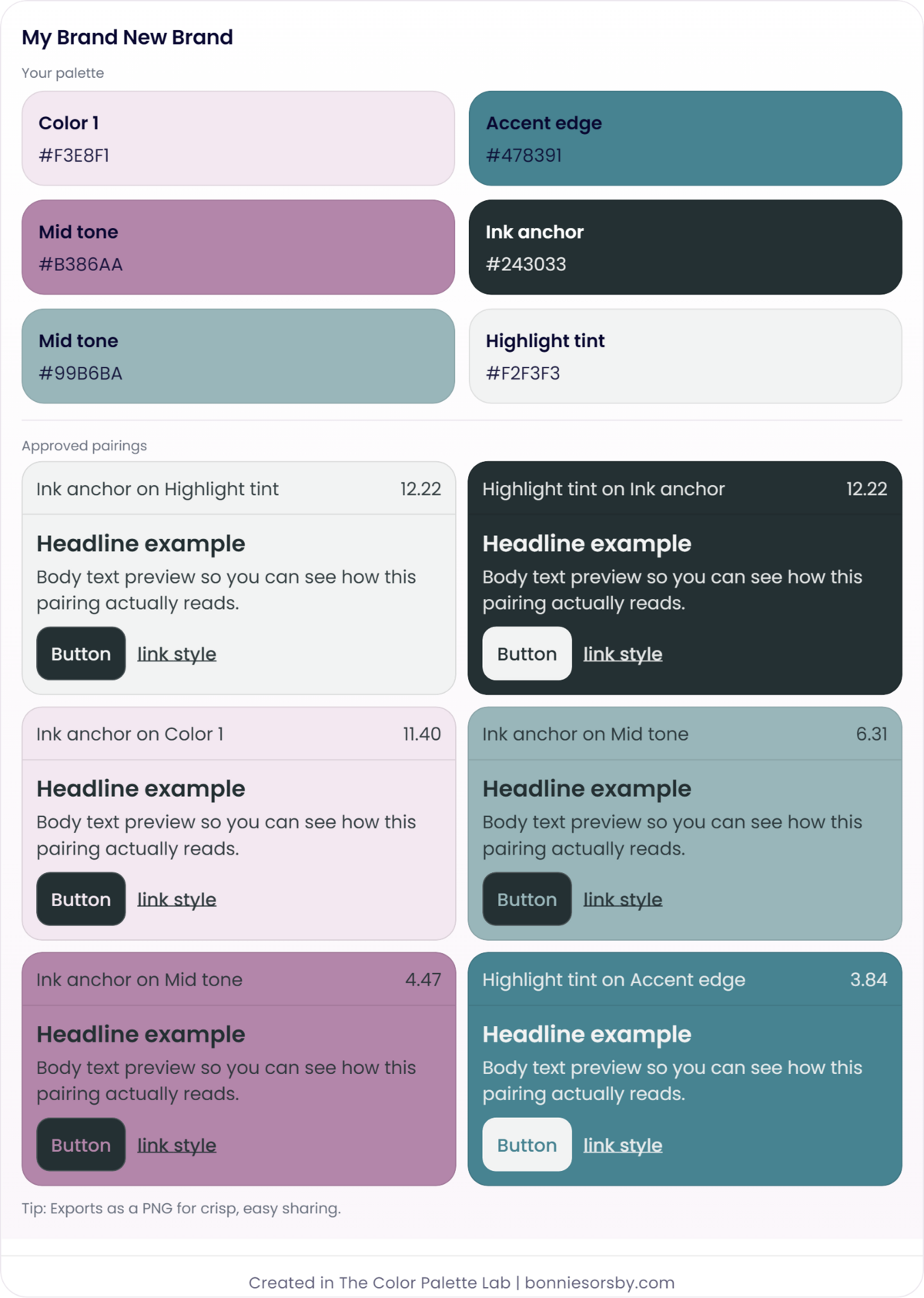
Test brand colors in context, not as swatches
This is where many brand color palette ideas break down.
Colors rarely fail because they’re “wrong.” They fail because they weren’t tested where they’ll actually be used. Text on backgrounds. Buttons on sections. Accents next to neutrals.
Testing colors in context reveals problems early. It also shows you where small adjustments can dramatically improve clarity without changing the overall feel of the palette.
This is exactly why using a brand color palette builder matters. It allows you to see how your colors behave together before you commit to them.

Make contrast part of the palette, not an afterthought
A brand palette that looks beautiful but struggles with readability will always create friction later.
Contrast affects:
- Accessibility
- Usability
- Professionalism
- Trust
You don’t need to design in black and white to get contrast right. You just need to test your pairings intentionally. Small shifts in value or saturation often make the difference between a palette that works and one that quietly causes problems.
Checking contrast as part of building your palette saves time, revisions, and second guessing down the road.
New to the concept of color contrast? You might appreciate this blog post:
WCAG Color Contrast Explained for Websites and Brands
Build for flexibility, not perfection
Brand color palettes are not static.
They need to support new pages, new offers, new formats, and evolving content. A palette that only works in one layout is fragile. A palette built as a system is resilient.
This is why refinement matters more than finding the “perfect” colors on the first try. When your palette can flex without breaking, you’ve done it right.
Where the Color Palette Lab fits into the process
Once you have a direction, the Color Palette Lab becomes the place where ideas turn into decisions.
Instead of guessing, you can:
- Test brand colors together
- Refine combinations in real use cases
- Adjust contrast intentionally
- Build a palette that works for both brand and website use
It’s designed for the stage where you want confidence, not just inspiration.
A brand color palette is a system
When you approach color as a system instead of a shortcut, your brand becomes easier to apply, easier to grow, and easier to trust. The goal isn’t just to like your colors. It’s to rely on them.
And when your palette supports everything you build on top of it, you’ll feel the difference immediately.
Ready to test your brand colors instead of guessing?
Explore The Color Palette Lab™ >>