Color Palette Checker:
How to Test Colors Before You Commit
If you already have colors but still feel unsure about them, you’re in the right place.
This is the moment most people hit after inspiration fades. You’ve gathered ideas. You might even like your palette. But something still feels off. You’re not sure if the colors actually work together, if they’ll hold up on a website, or if you’ll regret locking them in later.
That’s where a color palette checker comes in.
A color palette checker isn’t just about generating new ideas. It’s also about validating the ones you already have.
What a color palette checker actually does
A color palette checker helps you answer one simple question:
Do these colors work together in real use?
Instead of looking at swatches on their own, a palette checker lets you:
- Test colors side by side
- See how they behave as a group
- Check readability and balance
- Catch issues before they become expensive fixes
This is especially important for brand and website work, where colors have to function across many contexts, not just look good once.
Color palette Tester vs color palette generator
This is where a lot of confusion happens.
A color palette generator is designed for exploration. It gives you ideas when you’re starting from scratch. That’s useful early on, and we broke this difference down more deeply in the Color Palette Generator vs Builder post.
A palette checker, on the other hand, assumes you already have colors. Its job is to help you test, refine, and validate those choices before you commit to them.
If a generator helps you start, a checker helps you finish.
Is a color palette checker the same as a color palette tool?
Not exactly, but they’re closely related.
A color palette tool is a broader category. It can include generators, checkers, builders, and testing tools. A palette checker is a specific type of tool focused on evaluation, not creation.
This distinction matters because many people don’t need more ideas. They need confidence that the ideas they have won’t fall apart in practice.
Why Testing a palette is Important for brands and websites
Colors behave very differently once they’re applied.
A palette that looks balanced as swatches can struggle when used for:
- Website backgrounds and text
- Buttons and calls to action
- Long-form content
- Multiple pages and layouts
This is why brand color decisions often feel harder than expected. It’s not about taste. It’s about testing.
In the How to Build a Brand Color Palette Designers Trust post, we talked about thinking in systems instead of single choices. A color palette checker supports that exact mindset.
How a color palette checker supports accessibility
A color palette checker is not the same thing as a color accessibility checker, but it plays an important supporting role.
Accessibility issues often show up at the palette level, not just in individual color pairs. If two colors don’t have enough contrast, the problem isn’t always the specific hex codes. It’s how the palette was structured in the first place.
For deeper accessibility testing, a dedicated contrast or WCAG checker is essential, and we covered that in the WCAG Color Contrast, Sans Headache post. But checking how colors work together as a system helps prevent accessibility problems before they appear.
This is especially important for website color accessibility, where readability and clarity affect trust and usability.
Checking palettes in context, not theory
One of the biggest advantages of a color palette checker is context.
Instead of asking “Do I like these colors?” you get to ask:
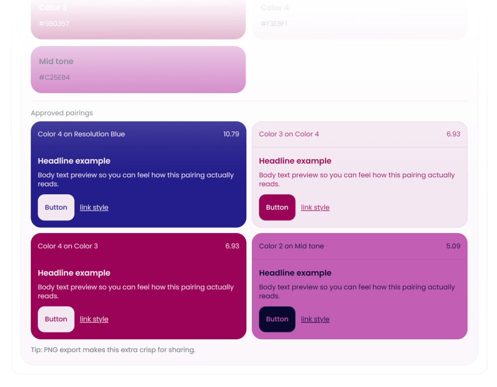
- Does this text read comfortably? Do they meet WCAG color contrast standards?
- Do buttons stand out enough?
- Do accents feel intentional or distracting?
- Does the palette still work when content grows?
Testing in context turns color decisions from guesswork into informed choices.
Where the Color Palette Lab™ fits
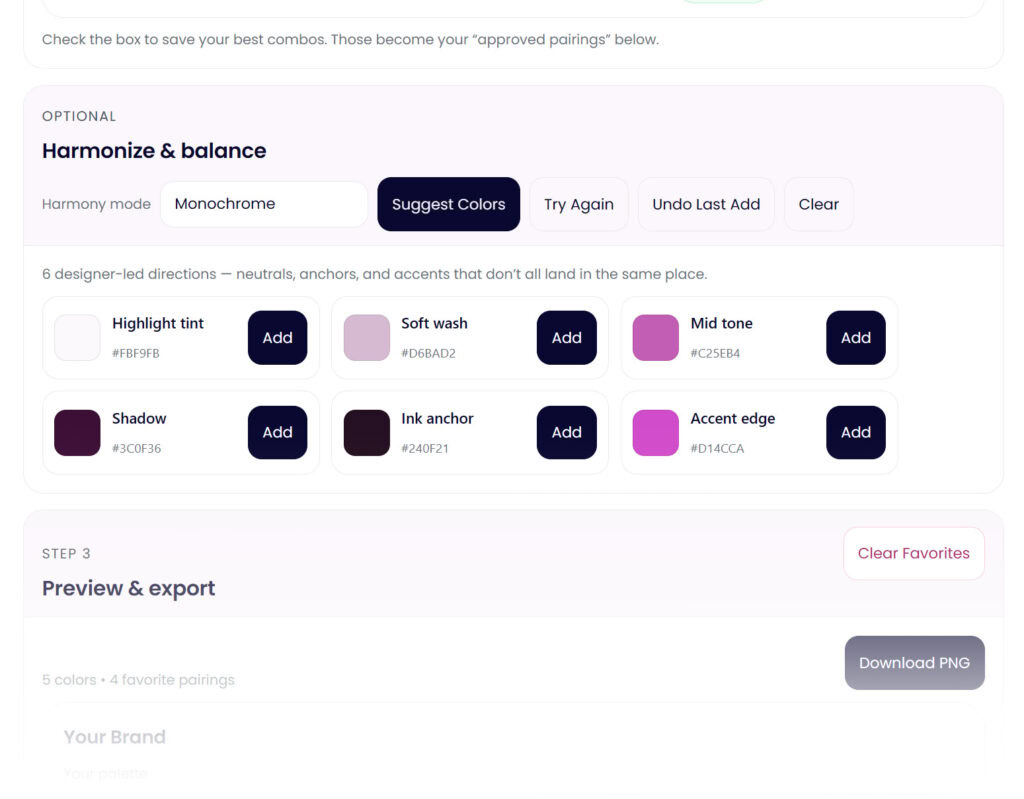
The Color Palette Lab™ functions as a color palette checker and more.
It’s designed for the stage where you want to test brand and website colors together, refine combinations, and see how your palette behaves across real use cases. Instead of checking colors one pair at a time, you can evaluate the palette as a whole.
This makes it easier to:
- Catch issues early
- Adjust without starting over
- Build confidence before committing
If you’ve already explored ideas and want to know whether your colors actually work, this is the natural next step.
When a color palette check is the right move
A color palette checker is especially helpful when:
- You like your colors but don’t fully trust them yet
- Your palette looks good but feels off in use
- You’re preparing for a website build or rebrand
- You want clarity before locking decisions in
It’s not about perfection. It’s about reducing regret.
Checking colors is part of a smart process
Testing a color palette doesn’t mean you’re unsure. It means you’re intentional.
Most color problems don’t come from bad ideas. They come from skipping the step where ideas are tested in real conditions. A color palette checker helps bridge that gap.
When your colors work together, everything built on top of them gets easier.
Ready to test your palette instead of guessing?
Explore the Color Palette Lab™ and see how your brand and website colors actually work together.


