The Color Palette Tool Suite I Wish I had Years Ago
If you’re searching for a color palette tool, chances are you’re not just looking for random color combinations. You’re looking for a way to build, test, and trust a color palette — one that actually works across websites, brands, and real design scenarios.
That’s exactly why I built my Color Palette Tool Suite.
This suite includes:
- a free color palette generator for exploration
- a free color contrast checker for accessibility and usability
- and a paid Color Palette Lab for developing and refining palettes in practice
Together, these tools support the full process of color palette development — from inspiration to implementation — instead of treating color as a one-click decision.
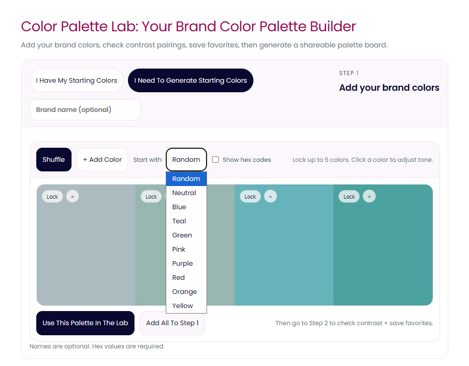
Here’s what color palette generation looks like inside the tool.
Why One Color Palette Tool Is Rarely Enough
Most popular color palette tools focus on a single moment in the process: generation.
Tools like Coolors and Adobe Color are excellent at quickly producing color combinations and sparking ideas. They’re fast, familiar, and useful … especially at the beginning.
I’ve written a full comparison of Coolors and Adobe Color elsewhere, because each serves a purpose. But neither is designed to help you develop a palette beyond that initial spark.
That gap is where most palettes start to fail.
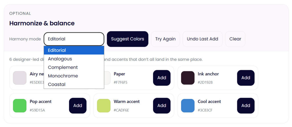
Palette harmonization and development happens once colors are tested together in context so you know what’s needed.
Color Palette Development vs Color Palette Generation
Generating colors and developing a color palette are not the same thing.
Color palette development asks different questions:
- How do these colors behave together?
- Do they hold up across light and dark backgrounds?
- Can they support hierarchy, emphasis, and readability?
- What breaks once text, buttons, and real layouts are involved?
This is the difference between a palette that looks good in isolation and one that actually works in use — especially for branding and web design.
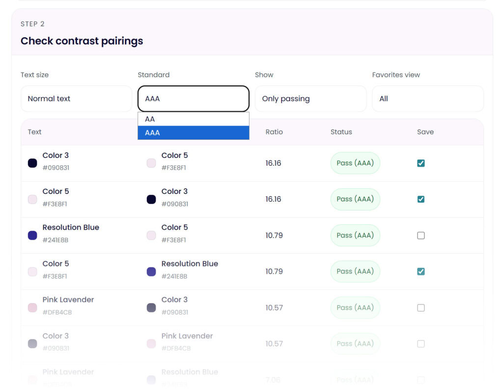
This is where contrast testing starts to change palette decisions.
Why Color Contrast and WCAG Matter (Whether You Like It or Not)
At some point, every functional palette runs into accessibility.
WCAG color contrast standards aren’t just technical guidelines — they’re a practical filter. They reveal which color combinations are usable, which ones are risky, and which ones will quietly cause problems later.
That’s why contrast checking isn’t an optional extra in this suite. I’ve broken down WCAG color contrast in more detail in a dedicated post, but here’s the short version: if your palette can’t pass basic contrast checks, it limits where and how that palette can be used.
Ignoring that step doesn’t make it go away… it just delays the problem.
The Color Palette Tool Suite (How It All Fits Together)
This is where most color palette tools stop and where mine intentionally continues.
- Color Palette Generator (free):
For exploration, inspiration, and starting points. - Color Contrast Checker (free):
For testing accessibility, readability, and hierarchy. - Color Palette Lab (paid):
For developing a palette into something stable, flexible, and usable across real projects.
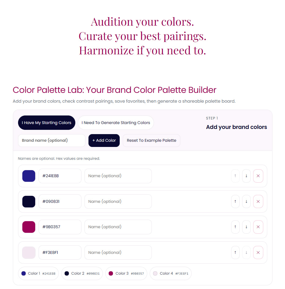
The Color Palette Lab is where colors stop being ideas and start becoming a system.
>> Explore The Lab <<
The Story Behind The Build
I didn’t build this suite to replace existing tools necessarily, but maybe it will for some. I built it to connect the parts that were always missing for me and so many other designers… the space between inspiration and execution.
If you’ve ever felt like your palettes look great in theory but fall apart in practice, this is the work the Color Palette Lab is designed to support.


