Coolors Alternative for Brand and Web Designers: Color Palette Lab vs Coolors vs Adobe Color
If you have ever built a color palette that looked great but started to fall apart once you actually used it, you are not alone. Most designers do not struggle to pick colors. They struggle to trust that those colors will work once applied to a real brand or website.
Popular tools like Coolors and Adobe Color are widely used for good reason. I personally used and mostly loved them for years. They are fast, accessible, and genuinely helpful at the right stage of the process.
The Color Palette Lab exists because I kept reaching a point where those tools were no longer answering the questions I had. This comparison is simply about clarifying where each tool fits, and why many designers eventually look for an alternative.
A Visual Comparison of Color Palette Tools
Color Palette Lab vs Coolors vs Adobe Color at a Glance
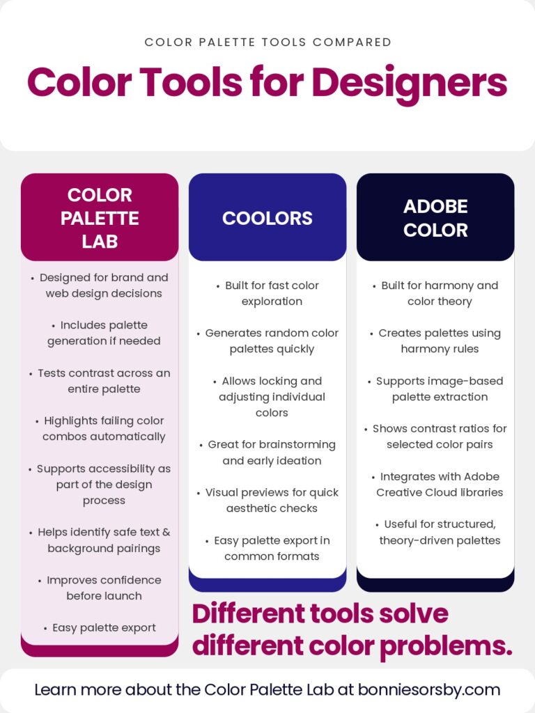
The chart above shows a comparison of the Color Palette Lab, Coolors, and Adobe Color. These tools are often lumped together, but they are built for different moments in the color decision process.
What follows is a deeper explanation of what each tool is actually designed to do, where the line is drawn, and why many designers end up needing something more focused on validation.
Color Palette Generators vs Palette Validation Tools
Most color palette tools fall into one of two categories.
Color palette generators are designed to create options. They help you explore, experiment, and move forward when you feel stuck. They expand possibilities.
Palette validation tools like The Color Palette Lab are designed to reduce risk. They help you test decisions, surface problems, and narrow options down to what actually works.
Both are useful. They just serve different purposes.
Many designers search for a Coolors alternative or Adobe Color alternative not because those tools failed, but because they reached a stage where generating more palettes was no longer the problem.
What Coolors Is Designed to Do
Coolors is an exploration focused color palette generator. It is excellent for early stage ideation and creative momentum.
With Coolors, you can generate random palettes, lock colors you like, adjust hue and saturation, and export palettes quickly. It is especially useful when you need inspiration or want to see a wide range of possibilities fast.
Coolors also provides simple visual previews so you can see colors next to each other and get a general feel for how a palette might look. These previews are helpful for intuition and aesthetic checks.
Where Coolors intentionally stops is validation. It does not test how an entire palette behaves across real use cases. Contrast checks are limited and secondary. Accessibility is easy to overlook. Designers often still feel unsure about which colors are safe for text, which should only be used as accents, and which combinations should never be used together.
Coolors helps you choose colors. It does not help you commit to them.
What Adobe Color Is Designed to Do
Adobe Color is a structured palette building tool rooted in color theory. It focuses on harmony rules such as analogous, complementary, and triadic relationships.
Adobe Color allows you to generate palettes from images, adjust values precisely, view contrast ratios between selected color pairs, and save palettes directly into Adobe Creative Cloud libraries. It is especially useful for designers who want theory driven structure and tight integration with Adobe software.
Adobe Color also provides visual context and numerical contrast information. However, contrast checks are pair based and must be manually selected. The tool reports ratios but does not evaluate how a full palette performs as a system.
Designers often describe Adobe Color palettes as technically correct but still uncertain in practice. Color harmony does not guarantee readability. Numbers do not automatically translate into confidence when applying colors across a website or brand.
Adobe Color helps you build palettes that follow the rules. It does not help you stress test those palettes before launch.
Why Visual Previews Are Not the Same as Testing
Both Coolors and Adobe Color show palettes in context via illustrative mockups and imagery. This is useful, but it is important to understand the limitation.
A visual preview helps you answer the question, does this look okay at a glance.
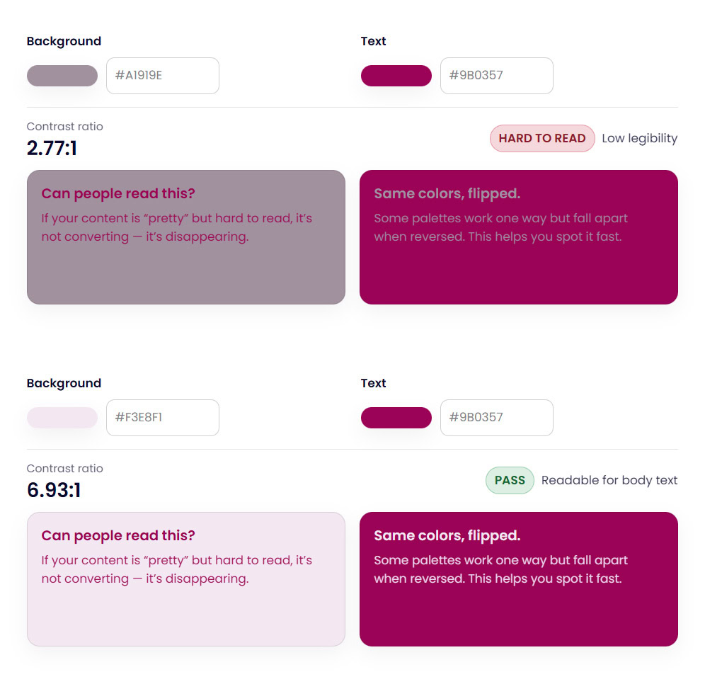
Testing answers a different set of questions. Which color combinations fail contrast standards. Which colors should never be paired. Which colors are safe for text across multiple backgrounds. Where accessibility issues appear across the entire palette.
Visual previews show you what you see. Testing shows you what breaks.
This distinction is where many designers realize they need a different kind of color palette tool.
Where Color Accessibility Often Breaks Down
Accessibility is rarely ignored on purpose. It is usually delayed or partially checked because tools do not make it easy to evaluate an entire palette at once.
Pair by pair contrast checks can miss broader problems. A palette may pass in one combination and fail in several others. Designers or DIYers often only discover these issues after a site is built or a brand is already in use.
This is where color accessibility becomes stressful instead of supportive.
Why the Color Palette Lab Exists
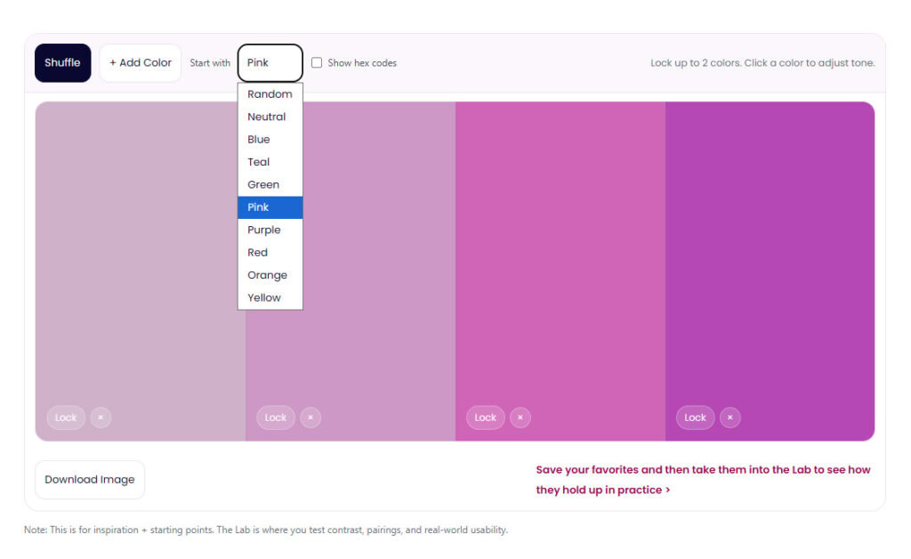
The Color Palette Lab was built for the moment after a palette looks finished, or you’ve found a color direction you’re happy with. Well, technically… it can help with color palette generation when you’re still exploring, too.
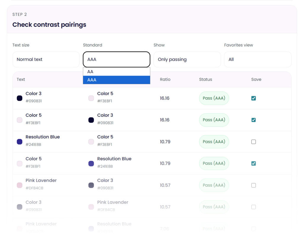
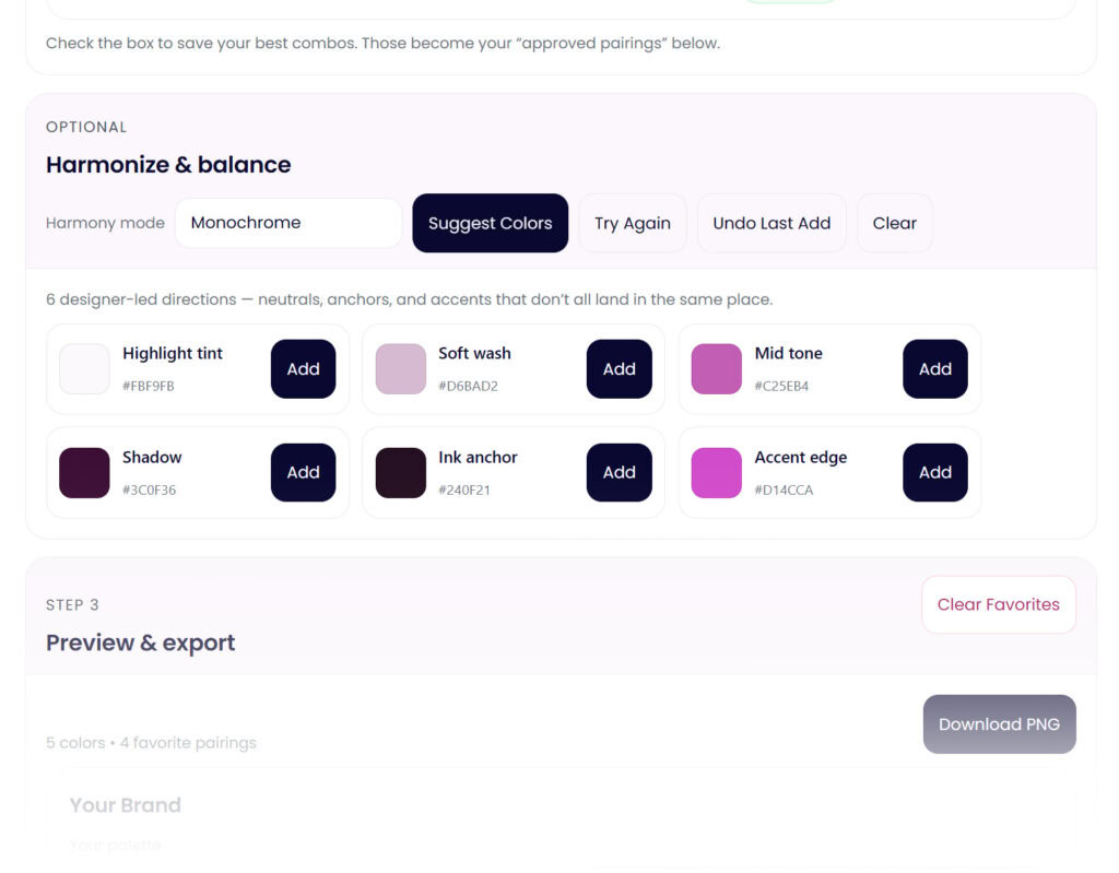
Ultimately, it is a professional color palette building and testing tool focused on validation, contrast, and accessibility. Instead of just generating new palettes, it also evaluates the one you already have. It tests contrast across a full palette, highlights failing color combinations, helps you harmonize, and surfaces issues early.
Accessibility is part of the workflow, not an afterthought. You can see which colors are safe for text, which should be used sparingly, and which combinations introduce risk. This makes it easier to design with intention instead of hoping things work later.
The goal of the Color Palette Lab is not more options. It is confidence.
When to Use Each Tool
Use Coolors when you are exploring ideas, brainstorming, or trying to build momentum at the beginning of a project.
Adobe Color is for when you want structured palettes based on color theory or need tight integration with Adobe applications.
And the Color Palette Lab when you are ready to validate a palette, test color contrast, check accessibility, and make confident brand or web design decisions.
If Coolors or Adobe Color already give you everything you need, you might not need the Color Palette Lab. The Lab exists for the moment those tools stop answering the questions you are asking.
A Final Note for Designers Looking for Coolors Alternatives
If you are searching for a color palette generator alternative, a Coolors alternative, or a professional color palette tool, it often means you are not looking for more inspiration. You are looking for reassurance.
Most color tools help you pick colors. Fewer help you trust them.
The Color Palette Lab was built for that exact gap.

