How to Choose Website Colors (Without Overthinking It)
Choosing website colors sounds simple until you’re staring at a screen wondering why nothing looks right together.
You save palettes. You try what “should” work. You adjust one color and suddenly the whole thing feels off again. If this feels harder than it should, you’re not wrong. Website colors behave differently than inspiration boards, logos, or single images. They have to work across pages, text blocks, buttons, backgrounds, and real humans actually reading them.
The good news is this doesn’t have to be a guessing game.
Why choosing website colors feels so hard
Most people start with aesthetics. A vibe. A mood. A palette they like.
The problem is that a website color scheme isn’t just about looking good in one place. Colors have to function together over and over again. A website color palette has to support readability, hierarchy, and consistency across an entire experience, not just one section of a page.
What looks great in a mockup can fall apart once you add body text, headlines, buttons, and multiple pages. That disconnect is usually where frustration sets in.
Start with function, not aesthetics
Before worrying about whether a color feels modern or on trend, it helps to ask a more practical question. Can people comfortably read this?
Function comes first. Always.
Your background colors need to support your text. Your accent colors need to stand out without shouting. Your buttons need to be obvious without clashing. When colors are chosen only for how they look together, readability is usually the first thing to suffer.
Once function is in place, aesthetics actually become easier. You’re not forcing colors to work. You’re building on a stable foundation.
How many colors a website actually needs
This is one of the most common questions, and the answer is usually simpler than people expect.
Most websites only need:
- One primary color
- One or two secondary colors
- One accent color
- A small set of neutrals
That’s it.
More colors don’t equal more personality. They usually create more visual noise. A focused palette gives you flexibility and consistency, which is what makes a website feel intentional and professional.
Test your colors before committing
This is where most people skip a step.
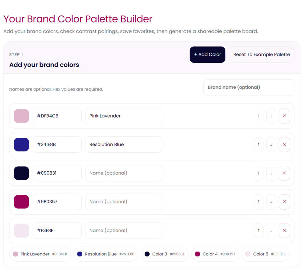
Instead of locking in colors based on instinct alone, it helps to actually test how they work together across different uses. Backgrounds with text. Buttons on sections. Accents next to neutrals.
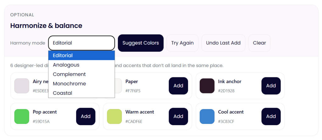
This is exactly why I built my Color Palette Builder. It lets you test combinations, refine them, and see how your palette behaves before you commit to it. It’s designed to support the process, not rush the decision.
Testing early saves a lot of second guessing later.
Don’t skip contrast (it matters more than you think)
Contrast is one of those things people don’t notice until it’s wrong.
Low contrast makes a website feel harder to read, less trustworthy, and more tiring to interact with. Even beautiful color choices can fail if the contrast isn’t working where it matters most.
If you want a quick gut check, my free color contrast checker lets you test color pairings instantly so you can see what’s working and what needs adjusting. You don’t need to memorize ratios or rules. You just need clarity.
Choosing website colors is a process, not a decision
Refining a palette doesn’t mean you’re indecisive. It means you care and you’re paying attention. Professional designers don’t “pick once and hope.” They test, adjust, and evolve palettes until they support the brand and the experience.
Future proof website colors aren’t about trends. They’re about building a system that can grow with your content, your offers, and your audience.
When you approach color this way, confidence replaces guessing. And everything downstream gets easier.
If you want help testing, refining, and building a website color palette that actually works in real life, you can explore the Color Palette Builder or start by checking your contrast for free. Both are there to support the process, not pressure the decision.


