
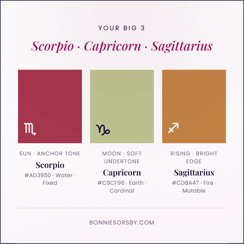
Together, these three are your Big 3, the placements this palette is built around.
See how Sun, Moon, and Rising work together →

How the colors are chosen
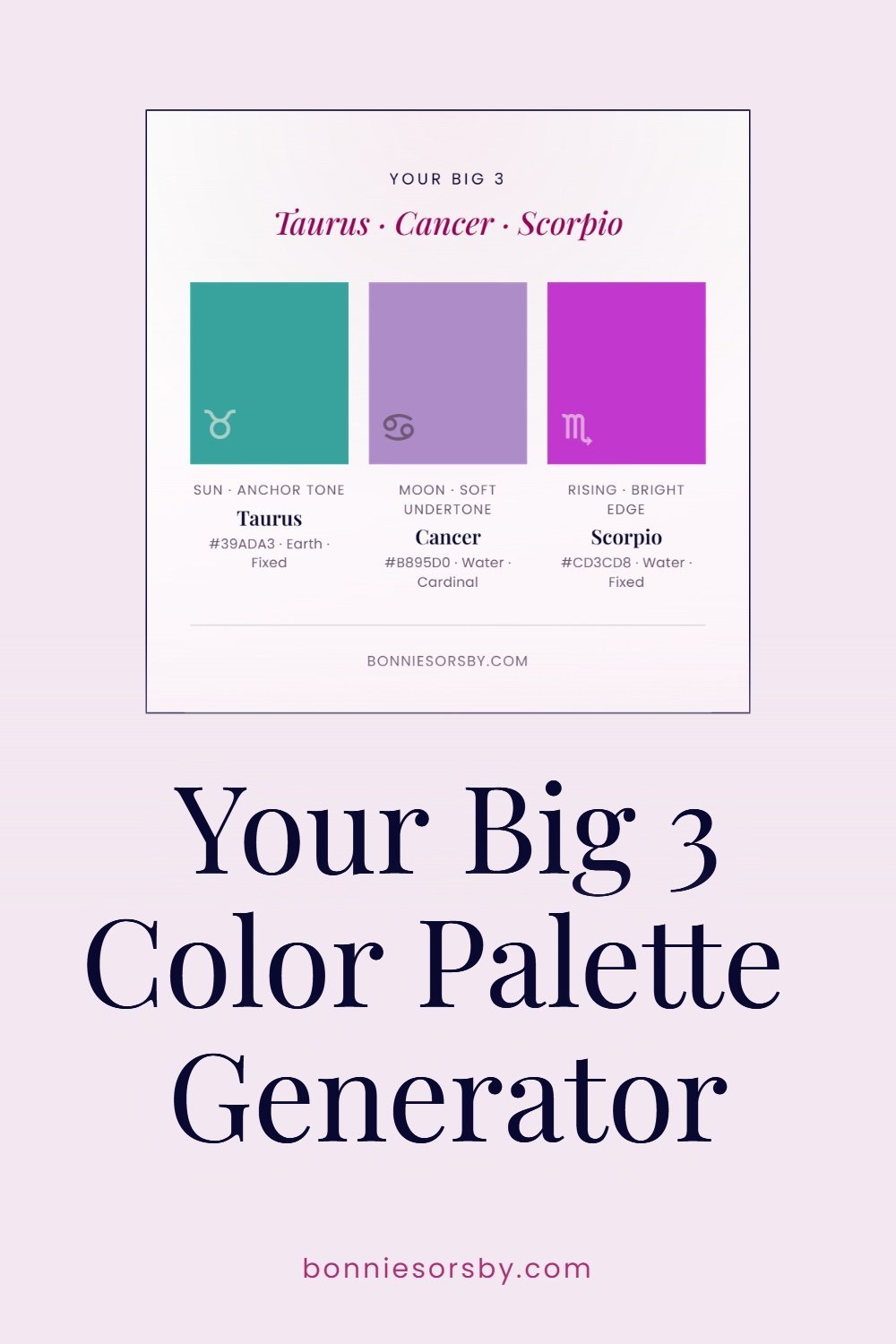
Every color in Your Big 3 Color Palette is intentionally selected rather than randomly generated. I developed the palette by considering the traditional qualities of each zodiac sign, its ruling element and modality, and the overall feeling that sign often evokes. Rather than assigning the same color to every fire sign or every earth sign, each sign receives its own distinct hue designed to reflect its individual character while still fitting naturally alongside the others in your palette.
The result isn’t meant to be an objective measurement or an official astrological standard. It’s a creative interpretation that blends astrology, color, and design into something that feels both meaningful and visually cohesive.
Where to Take Your Palette Next
This palette is three placements turned into colour, and where you go from here probably depends on which part of it you came for.
- You’re astrology-curious. Your Sun is what you’re here to express, your Moon is how you often process things before anyone else sees them, and your Rising is what people meet first, which can be the one that surprises you. Your Beautiful Birth Chart shows all three by sign and house with the aspects between them, and the free birth chart will draw yours if you only want to look.
- You want to use your chart in your branding, beyond the colours. How to use astrology in personal branding covers voice, positioning and the parts of a brand that a palette can’t carry on its own.
- You want a palette you can build with. The Color Palette Lab is where you test contrast, check accessibility and turn a set of colours into something that holds up on a real website.
- You’re building the whole thing. Where the brand underneath is what feels unsettled, branding and visual identity is the work of settling it before the colours have to carry it.
FAQ
What is a Big 3 color palette?
A Big 3 color palette turns your Sun, Moon, and Rising signs into a set of colors, one for each placement. Instead of just seeing three sign names, you get a visual moodboard built from the placements that shape your core identity, your emotional world, and how you come across to other people.
Do I need my exact birth time to use this?
You need it for an accurate Rising sign, since Rising changes roughly every two hours based on birth time and location. Sun and Moon are less sensitive to exact time, though Moon can still shift signs within a single day for some birth dates. If you’re not sure of your Rising sign yet, pull it from your free birth chart first, then come back here to generate your palette.
Is this affiliated with Pantone?
No. This tool uses original, astrology-inspired color mapping for entertainment and design purposes. It isn’t affiliated with, endorsed by, or sponsored by Pantone LLC, and it doesn’t pull from Pantone’s licensed color library.
What’s the difference between this and the Pantone birth chart trend going around right now?
The viral version uses four placements, Sun, Moon, Rising, and Venus. This tool uses three, Sun, Moon, and Rising, and adds a short line of interpretation for each one so the color comes with meaning attached instead of standing alone. If you want to see the full comparison, I broke it down here.
What’s the counterbalance layer?
After your Big 3 generates, you can reveal a second set of three colors built from complementary placements, ones that bring elements and energies into the mix that aren’t already present in your original three. It’s optional, and it’s a way to see your chart from outside the frame it usually gets read in.