
The 60-30-10 Color Rule: How to Pull a Room’s Palette From Art
The 60-30-10 color rule is a decorating guideline that divides a room’s colors into 3 parts: a dominant color covering about 60 percent of the space, a secondary color covering about 30 percent, and an accent color for the last 10 percent. It is one of the simplest ways to make a colorful room feel balanced.
As a painter, I find the rule very familiar. Almost every painting I make has one color that sets the mood, a second color that supports it, and a small, bright note that makes your eye land somewhere. Below, I break down 3 of my paintings into 60-30-10 palettes you can borrow for a room, plus 2 styled rooms that show the rule at full size.
What Is the 60-30-10 Rule?
The rule gives each color in a room a job:
- 60 percent, the dominant color. This is the background of the room: walls, a large rug, the sofa or bed, and big pieces of furniture. It sets the mood, so it is often the calmest color of the 3.
- 30 percent, the secondary color. This supports the dominant color and adds interest: curtains, accent chairs, bedding, a painted dresser or a second rug.
- 10 percent, the accent color. This is the spark: pillows, a lampshade, a vase, a throw, books and art. It is usually the boldest color and the one people notice first.
The numbers describe a feel. Nobody needs to calculate square footage. The point is that 1 color clearly leads, 1 color clearly follows, and 1 color is used sparingly enough to stay special.
Why the 60-30-10 Rule Works
Designers often explain the rule with a classic suit: the jacket and trousers are the 60, the shirt is the 30, and the tie or pocket square is the 10. The same logic runs through painting. When every color fights for the same amount of space, the eye has nowhere to rest. When one color leads, the others have something to play against.
The rule also solves the most common problem with colorful rooms, which is too many colors in equal amounts. Giving each color a size keeps a bold palette feeling calm and intentional, even when the colors themselves are bright.
How to Use the 60-30-10 Color Rule
- Start with something you love. A painting, a rug or a fabric already has a balanced palette built in. Pull your 3 colors from it, and the room has a ready-made reason to look the way it does.
- Choose your 60 for the biggest surfaces. Walls, floors, the sofa and the bed. A soft or muted version of a color is easier to live with at this size.
- Give the 30 to mid-size pieces. Curtains, chairs, bedding and a painted piece of furniture. This color should feel related to the 60 without matching it.
- Save the 10 for small things. Pillows, lampshades, ginger jars, a throw, books and art. Spread them around the room so the eye travels.
- Repeat each color at least 3 times. A color that shows up in only 1 spot looks like an accident. Three appearances make it look planned.
- Count wood, metal and white loosely. Warm wood, brass and white trim act as neutrals, so they rarely need a slot of their own.
60-30-10 Color Palettes From My Paintings
Every painting below has a built-in 60-30-10 palette. Each card shows the 3 colors in proportion, plus where each one could go in a room.
Showing Up: Blush Pink, Leopard Tan and Lipstick Red
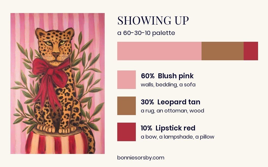
In Showing Up, pink stripes fill most of the canvas, the leopard brings warm tan and brown, and a red bow pulls it all together in a fairly small space. In a room, that becomes blush walls or bedding, a leopard rug or ottoman with warm wood, and a single red lampshade or pillow. The red works because there is so little of it.
So This is Abundance: Periwinkle, Leaf Green and Lemon Yellow
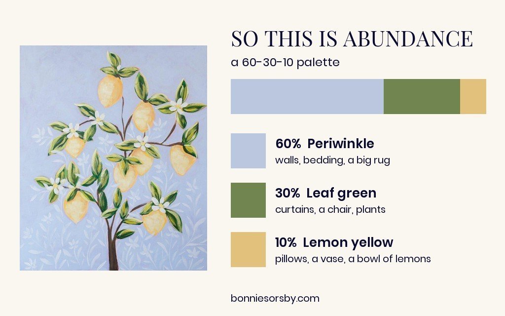
In So This is Abundance, soft periwinkle fills almost the whole canvas, the leaves bring a clear green, and the lemons are the small, sunny accent. Yellow sits across the color wheel from periwinkle, so a little of it glows. In a room, that becomes periwinkle walls or bedding, green curtains or a chair, and yellow in a few pillows, a vase or a bowl of real lemons.
Tuned In: Warm Sand, Olive Green and Poppy Red
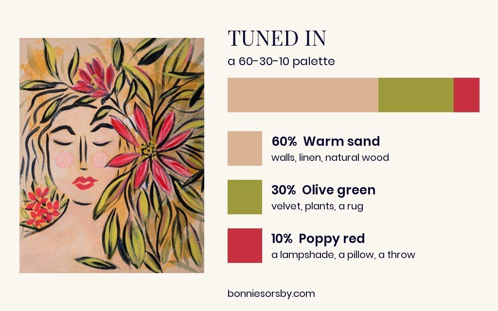
Tuned In is a warm version of the rule. Warm sand covers most of the paper, olive leaves sweep around her face, and the red flowers and lips are the accent. That palette suits a room with linen, natural wood and warm white walls, olive velvet or plants as the 30, and red kept to a lampshade, a pillow or a throw. It is the same idea as the unexpected red theory, with the red sized as the 10.
60-30-10 in a Real Room
These 2 bedrooms are styled mockups with my real paintings shown at true size, and both follow the rule.
A Powder Blue Bedroom
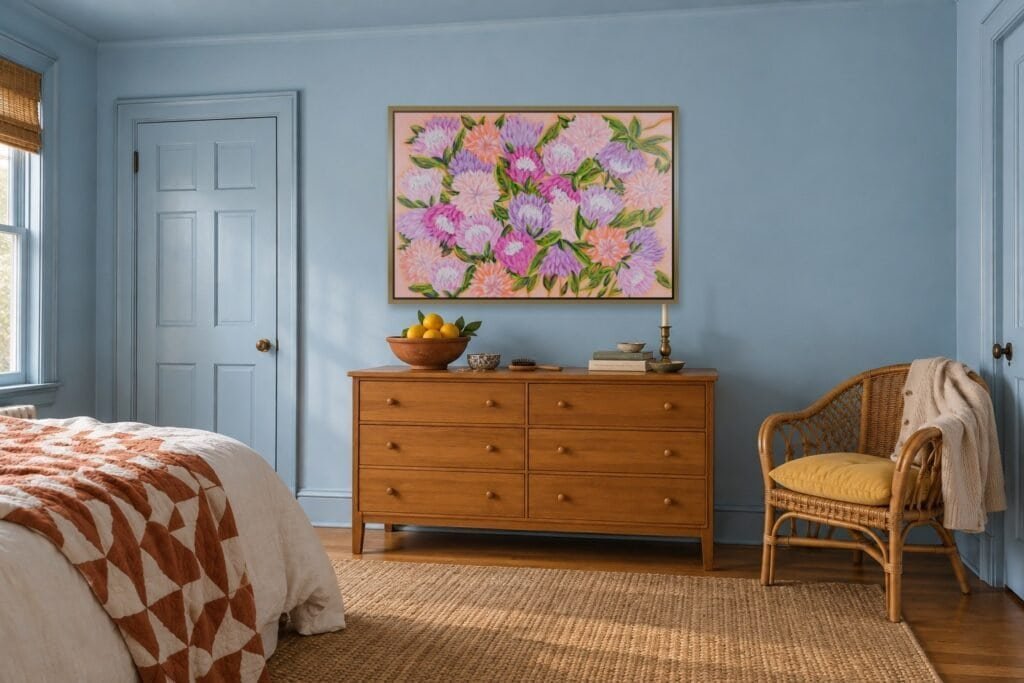
Powder blue is the 60 here, covering the walls, trim and ceiling. Honey wood and rattan make up the 30, and the warm pinks and oranges in Unexpected Blessings and the terracotta quilt are the 10. The accent is warm and the room is cool, so the painting reads as the heart of the room.
A Warm White Bedroom With Red
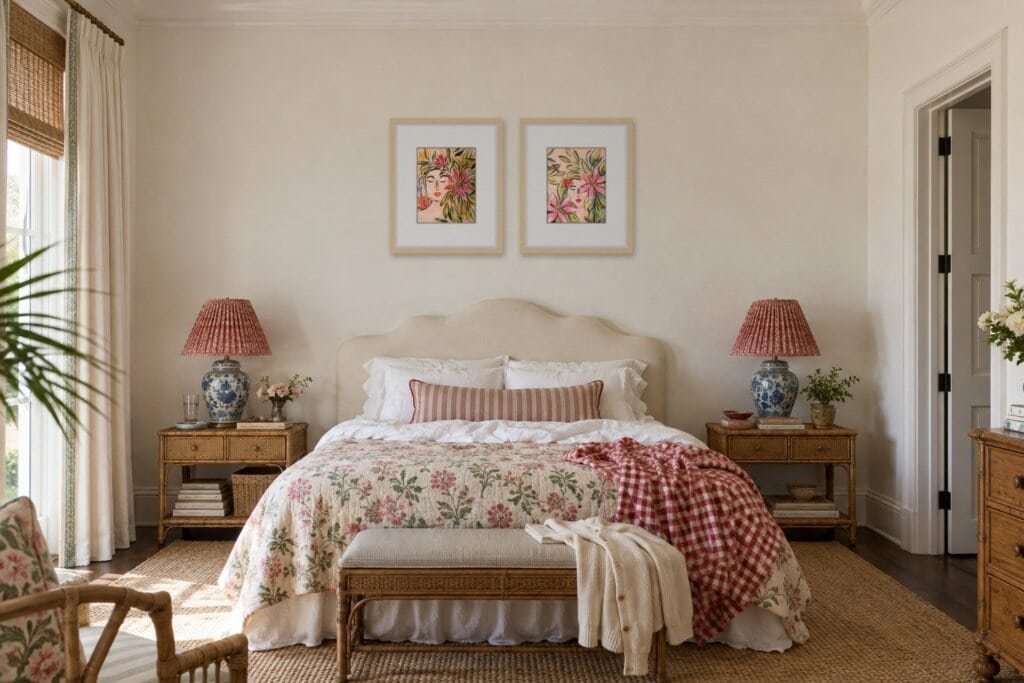
Warm white and cream take the 60, blue and white porcelain lamps and the floral quilt share the 30, and red is the 10: pleated lampshades, a ticking pillow, a gingham throw and the big flower in Tuned In. This is the same idea as the unexpected red theory, with the red repeated just enough to look planned.
Common 60-30-10 Mistakes
- Making the accent too big. Once the bold color takes over a sofa or a whole wall, it stops being an accent. Keep the strongest color in the smallest amount.
- Using the accent in only 1 place. A single orange pillow can look lost. Repeat it in a vase, a book and a piece of art.
- Choosing 3 colors of equal strength. If all 3 are bright, let the 60 be a softer tint of one of them.
- Forgetting the art. A painting often holds all 3 colors at once, which makes it the easiest way to tie the palette together.
When to Bend the Rule
The 60-30-10 rule is a starting point. Maximalist and grandmillennial rooms often layer 4 or 5 colors, and they still work because one color clearly leads and the boldest colors stay small. If you love pattern, think of each pattern as carrying its own colors, and make sure 1 of them repeats around the room.
You can also split the 10 into 2 small accents, like red and cobalt, as long as each one shows up more than once. For more rooms built this way, see my colorful living room ideas and colorful bedroom ideas.
Frequently Asked Questions About the 60-30-10 Rule
What is the 60-30-10 color rule?
It is a decorating guideline that uses a dominant color for about 60 percent of a room, a secondary color for about 30 percent and an accent color for about 10 percent.
Does white count in the 60-30-10 rule?
It can. In a room with white walls, white is often the 60. White trim and ceilings in an otherwise colorful room usually act as a neutral and do not need a slot of their own.
Which color should be the 60?
Choose the color you would be happy to see on every wall. Softer, lighter or more muted colors are usually easier to live with in large amounts.
Can the 60-30-10 rule use more than 3 colors?
Yes. Many designers use it with 3 main colors plus neutrals like wood, white and metal, or split the 10 percent into 2 small accents.
How do I choose colors for the 60-30-10 rule?
Start with a painting, rug or fabric you love and pull the 3 main colors from it. A color palette generator can also help you test combinations before you paint.
Is art part of the 10 percent?
Usually. A painting often carries the accent color, and it can also echo the 60 and 30, which helps the whole room feel connected.
If you would like a painting to set the palette for your room, you can explore my original paintings, or browse Studio Steals for smaller pieces at a gentler price.