
How to Mix Color and Pattern Like an Artist
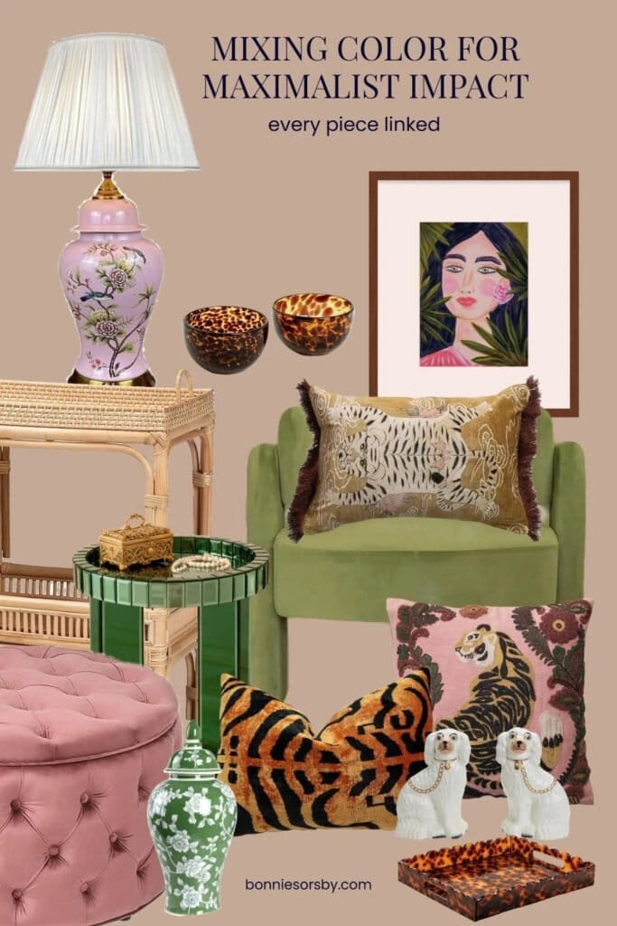
Mixing color and pattern in a room works the same way it does in a painting: you repeat a few tones all the way across, so your eye travels from piece to piece and everything feels connected without matching. A room built this way can hold a pink lamp, tiger print pillows, green velvet and tortoiseshell at once, and it reads as fun, full and coordinated enough. This is how I put together the maximalist corner below, and it is the same thinking I use every time I paint.
This post contains Amazon affiliate links. If you buy through them, I may earn a small commission at no extra cost to you.
Coordinated, Not Matchy
A room where every piece matches feels like a showroom. A room where nothing relates feels like clutter. The sweet spot sits in between: pieces that clearly belong to the same family without being twins. I would not call this corner a perfect room, and that is part of its charm. Each piece is a little different, but the same few colors keep turning up, so it all hangs together.
If you love traditional pieces, this approach overlaps with grandmillennial style. Turn the color and pattern up a few notches and you are in maximalist territory.
How to Mix Color Like an Artist
Start with the art
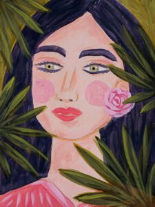
Pull your palette from a painting. She Just Knew has deep navy hair, leafy greens, pink cheeks and a pink rose, and every color in this corner comes from her. When the art sets the palette, the rest of the room has something to answer to.
Repeat each color at least 3 times
When I paint, a color never appears in just a single spot. A touch of pink in a cheek gets echoed in a rose and again in a sleeve, so the color moves across the canvas. Rooms work the same way. Here, pink shows up in the lamp, the tufted ottoman and the embroidered tiger pillow. Green shows up in the velvet chair, the glass side table and the ginger jar. Repeating each color around the room is what makes bold choices feel intentional.
Vary the shade, keep the family
Your repeats can be different shades. The chair is olive, the side table is emerald and the ginger jar is a deeper green with white. The lamp is a soft pink and the ottoman is a dusty rose. Different shades of the same color add depth, the way a painter mixes a few versions of a hue straight off the palette.
Use warm neutrals that act like a color
Tortoiseshell, rattan and gold do a lot of work here. They are warm and textured, so they connect the pinks and greens without fighting them. The tortoise bowls, the scalloped tortoise tray and the rattan console all play that role.
Let the wall join in
A bold room needs a wall that participates. This warm mocha lets the pinks and greens glow. A cool gray would flatten everything, so choose a wall color with some warmth to it. You can test wall colors behind a painting in my free Try a Frame tool.
How to Mix Prints and Patterns
Mix by scale
Pair a large pattern, a medium pattern and a small pattern. The tiger velvet is big and graphic, the embroidered tiger is medium, and the tortoise is small and speckled. Patterns in different sizes layer easily, while patterns in the same size compete.
Connect patterns through color
Patterns can be completely different as long as they share a color. The pink tiger pillow, the pink lamp and the pink ottoman have nothing else in common, yet they read as a set because of that shared tone.
Give the eye places to rest
Every busy pattern needs a solid neighbor. The plain velvet chair and the solid ottoman sit between the prints, the same way a calm area of a painting makes the detailed parts stand out.
Add something classic and something funny
A pair of white Staffordshire dogs and a chinoiserie lamp add history. A tiger pillow adds wit. A room is more fun with a little humor in it.
Shop This Corner
Every piece from the board, in one place. The painting is linked above.
 Pink chinoiserie lampHand-painted birds and peonies with a pleated shade.See it on Amazon
 Rattan console tableA warm, airy base for the lamp.See it on Amazon
 Green glass side tableA jewel-toned accent beside the chair.See it on Amazon
 Green velvet accent chairSoft olive velvet in a sculptural shape.See it on Amazon
 Tiger velvet pillowBold orange and black velvet.See it on Amazon
 Embroidered pink tiger pillowA tiger on pink with flowers.See it on Amazon
 Tiger rug pillow with fringeGold velvet with a fringed edge.See it on Amazon
 Pink tufted velvet ottomanRound, tufted and a little glam.See it on Amazon
 Green chinoiserie ginger jarGreen and white florals.See it on Amazon
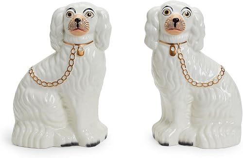 White Staffordshire dog pairA classic pair with gold chains.See it on Amazon
 Tortoise bowls, set of 2Glass bowls in warm tortoiseshell.See it on Amazon
 Scalloped tortoise trayA scalloped edge for a coffee table or vanity.See it on Amazon
Prices and availability change often, so check the listing for current details.
The Art: She Just Knew and Trust Your Gut
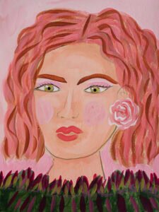
She Just Knew has found her home, but her pink-haired sister Trust Your Gut is still available. She has the same green eyes and pink rose, with coral hair and a band of leaves along the bottom, and she would anchor a maximalist corner just as well.
Want to see how a piece would look framed before you decide? Try it in my free Try a Frame tool, and see my guide to framing original artwork.
Frequently Asked Questions About Mixing Color and Pattern
How do you mix colors in a room without it looking chaotic?
Pull a palette from a piece of art, choose a couple of lead colors, and repeat each of them at least 3 times around the room. Add warm neutrals like tortoiseshell, rattan or gold to connect them.
How do you mix patterns in a room?
Mix patterns in different scales, a large, a medium and a small, and connect them with a shared color. Place solid pieces between busy patterns so the eye has somewhere to rest.
Should everything in a room match?
No. A room feels more personal when pieces coordinate through shared colors. Aim for pieces that look like they belong to the same family.
What is maximalist decor?
Maximalist decor is a style that layers bold color, mixed patterns, art, texture and collected objects in one room, chosen with intention so the room feels personal and full.
What wall color works with lots of color and pattern?
A wall color with some warmth works best. Warm mocha, rosy taupe, butter yellow and soft terracotta all let bold accents glow, while cool grays can flatten a colorful room.
If you would like to see what might live on your walls, you can explore my original paintings, or browse Studio Steals for smaller pieces at a gentler price.
To see this corner beside 2 other bold looks, browse my colorful living room ideas.