
Impressionist Style Artwork
Impressionist style artwork is painting that chases light, color, and feeling over photographic precision, built from loose, visible brushwork instead of smooth, blended realism. That is the short version. The longer version is everything I paint.
What “Impressionist” Really Means
The Impressionists weren’t trying to paint things exactly as a camera would. They were painting what light does to color, and what a moment feels like before the mind has time to tidy it up. A flower rendered this way doesn’t ask to be mistaken for a photograph. It asks to be recognized, the way you recognize a feeling before you’ve named it.
That’s the tradition I work inside of. My florals are still florals, you can tell a dahlia from a rose, but I’m not interested in rendering every petal with photographic correctness. I’m interested in what the color is doing and how fast I can get the feeling of the flower down before I start fussing with it.
The Tate puts the technique itself more plainly than I could: “Brushwork became rapid and broken into separate dabs in order to render the fleeting quality of light.” Dabs instead of blending, because light doesn’t hold still long enough for blending. That one sentence is most of what you need to know before you look at the rest of this page.
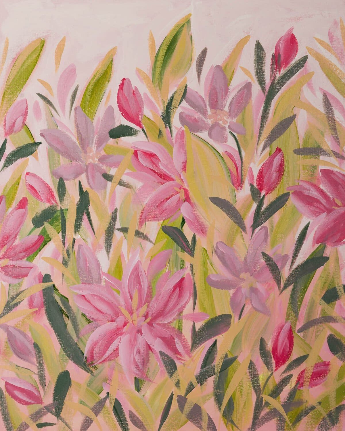
Love this piece? “Telling it like it is” is her name. Shop here.
Gestural Brushwork = Love
Impressionism describes what I’m doing with a subject. Gestural describes how the paint got there, and that’s the part other people mirror back to me most often. It’s my most distinct feature, more than any color I reach for or any flower I paint over and over.
A gestural stroke stays exactly where the brush left it. Look closely at one of my paintings and you’ll see where the brush loaded with color and dragged, where it ran dry at the end of a leaf, where one color sits hard against another instead of blending into it. There’s no attempt at illusion, no hiding the hand that made the mark. If a painting of mine reads as a flat, allover pattern of confident strokes, that’s not an accident. That’s the mark doing the work instead of the illusion doing it.
I’m a painter who happens to live and work in Palm Beach County, outside the gallery circuit, and this is what I do with my hands all day. Come see it for yourself, my work is here.
Instinct Over a Plan
The Florida Highwaymen, a group of landscape painters who worked across this state in the mid-twentieth century, get described the same way. Their entry on Wikipedia notes they “eschewed any formal color theory and relied on instinct and intuition” to paint their steady stream of beaches, palm trees, and Everglades scenes, working fast because speed was how they made a living. Sometimes the paintings were stacked before the oil was even dry.
That instinct and intuition is exactly how I paint too. I work almost entirely from intuition, no formal color theory, just whatever the brush wants to do next. Occasionally I’ll reference a photo for a specific flower’s structure, or start from a bouquet that caught my eye, but the painting itself happens without much thought once I’m in it.
I paint in one sitting whenever I can. That’s part of why oil never stuck for me. Oil wants time between layers, and I want the whole piece to exist in the same burst of attention it started in. Acrylic dries fast enough to keep up with how I work.
What Really Happens When I Paint
What pulls me toward a flower varies. Sometimes it’s an inexplicable pull I can’t explain. Other times it’s the meaning, the color, the form, the size.
If you want to give God a laugh, tell him your plans. I believe each painting is a live expression waiting to come through, and it’s a surprise every time. I grab color instinctively and develop the piece and palette as I go, trying to stop myself before I’ve overdone it.
Whether a piece is working is a question I’m answering every second. Either it is or it isn’t. I try not to overthink it until I inevitably hit a point where I think, “aww man,” and get stuck for a minute. But that first instinct is usually the right one. It’s just paint, paper, canvas, time. I try not to waste materials, so there’s a real tension between that instinct and not wanting to stifle the piece. I’m still finding my footing in that balance.
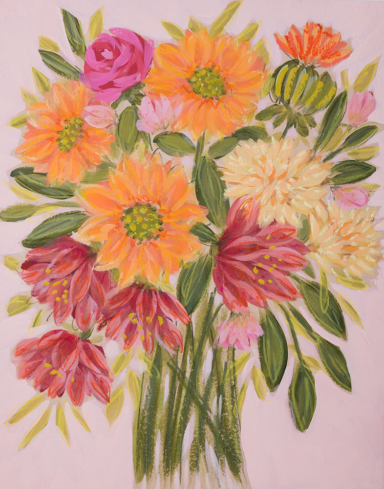
Canvas and Paper Behave Differently
Canvas is where the gestural blocks really live for me. A loaded brush drags color across the weave and leaves ridges of its own, which is part of what gives that flat, confident, allover feeling its texture.
Paper is where I often bring in pastel for texture and line, the chalky breakup in a petal, a thin colored line down a leaf that a brush can’t make. Pastel needs a consistent tooth to grip, and ridged acrylic doesn’t give it one, it skips the valleys and clumps on the ridges instead of laying down clean. Paper holds it more evenly the whole way across. The difference you’re seeing comes down to what each surface can physically hold, and I match my approach to that.
Florals, Coastal Color, and This Beautiful Florida Light
Most of what I paint comes back to flowers and color, and most of that comes back to living in Palm Beach County, I guess. The light here is bright and relentless, and it shows up in the palette I reach for before I’ve consciously decided anything: hot pinks, citrus yellows, the teal that shows up in water more than sky. Coastal color is simply what’s outside, every time I look up from the canvas.
Palm Beach County shows up naturally in the work. Color is everywhere here, and people aren’t afraid of it the way they can be in other parts of the world. Nature inspires the rest, which is probably why I can’t seem to stop painting it.
If any of this is the kind of work you’d want to live with, the full collection is here, and Studio Steals is a fun little place to start collecting.